You want to build beautiful, effective pages for your WordPress site but you’re not a developer…
It’s a problem as old as time (or at least as old as WordPress!). And it’s exact problem that page builder plugins were made to fix.
A few months ago, Thrive Content Builder was one of those plugins. Now, Thrive Content Builder is gone, replaced by something new called Thrive Architect.
Like Thrive Content Builder, Thrive Architect helps you build complex pages in WordPress without needing to know any code. But it does so with an entirely new interface and more styling options.
In general, I think it’s a major upgrade over Thrive Content Builder. Read my Thrive Architect review for a deeper look at just why I think that…
Thrive Architect Review Summary: What The New Plugin Does
Thrive Architect is a complete relaunch of the original Thrive Content Builder plugin. While there are many similarities between the two in terms of available elements and landing page templates, the core differences are that:
- Thrive Architect is more compatible with all themes, whereas before some features in Thrive Content Builder were reserved specifically for Thrive Themes’ own themes.
- You have more styling options, especially when it comes to the mobile responsive version of your designs.
- It’s built to be faster – the plugin is optimized to avoid some of the slow-downs people encountered with Thrive Content Builder.
- The UI is cleaner – the new interface is much more modern (and clearly inspired by Elementor – you’ll notice quite a few similarities).
Additionally, Thrive Themes changed what had previously been my biggest criticism of Thrive Content Builder:
No more shortcode lock-in.
Now, if you ever make the decision to deactivate the plugin, it will leave behind clean code instead of the mess of shortcodes previously left by Thrive Content Builder. That’s a massive improvement right off the bat and puts it on par with page builders like Elementor and Beaver Builder when it comes to left-behind code.
Of course, you still have all the core features you’d want from a WordPress page builder. That means:
- Drag and drop page builder
- 184+ templates for landing pages
- In-line text editing
- Helpful advanced elements like testimonials and countdown timers
- Full-width layouts – these now work even with all themes, instead of just Thrive Themes’ themes.
- Hover effects
- Detailed styling options
- Mobile responsive design options
Let’s go hands-on and check out everything in more detail…
Building A Page With Thrive Architect
Once you install and activate Thrive Architect, you’re ready to start building right away.
It’s worth noting that, like other Thrive Themes products, Thrive Architect doesn’t follow the normal WordPress GPL licensing scheme.
As such, you’ll need to input your license key before you can use any part of the plugin, unlike many WordPress plugins where the license key is only tied to updates.
Personally, that doesn’t especially bother me, but it doesn’t mesh with the WordPress GPL ethos and some purists might take issue.
With that out of the way, let’s jump into the Thrive Architect interface!
Here’s what it looks like when you first open the interface (I’m using a blank page template, which is why you don’t see my WordPress theme):

You can also switch the sidebar to the right side if you prefer working that way.
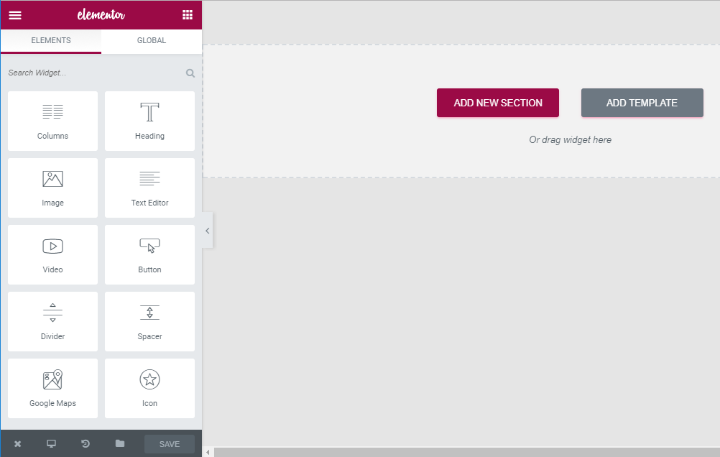
As I mentioned, if you’ve ever used Elementor, you’ll immediately notice some similarities. Here’s what the base Elementor interface looks like for comparison:
Using Thrive Architect Elements To Build A Page
Thrive Architect divides its elements into two sections:
- Foundation – as the name suggests, these are the core elements of any page and likely what you’ll use the most. It’s nice that they’re always handy at the top of the page.
- Building Blocks – these elements are more specific and do things like add testimonials, countdown timers, and more. They’re helpful, but you won’t necessarily use each element for every page that you build.
To start building your page, all you need to do is drag an element from the left sidebar to the right sidebar:
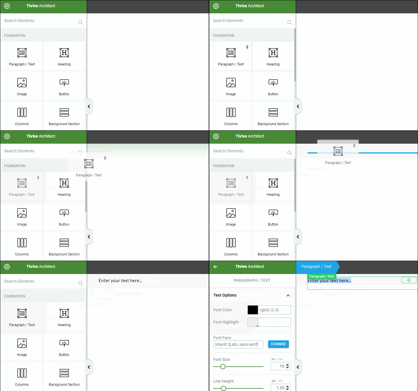
Unlike many page builders, Thrive Architect doesn’t force you to create a section or column layout before you add elements. Instead, you can just go straight to dragging and dropping (it’s similar to Beaver Builder in this respect).
That doesn’t mean you can’t put elements inside containers for more control, though. Thrive Architect gives you a few different sections you can use to hold (and style) groups of elements:
- Background section – lets you create a neat full-width and/or “fill screen” background
- Content box – can hold multiple elements or draw attention to a single element
- Columns – makes it easy to create a pre-designed column structure, though it’s not necessary to create multi-column designs
Two Of My Favorite Features In Thrive Architect
Here are two things that I love about Thrive Architect. As far as I know, no other page builder offers the combination of these two features. They are:
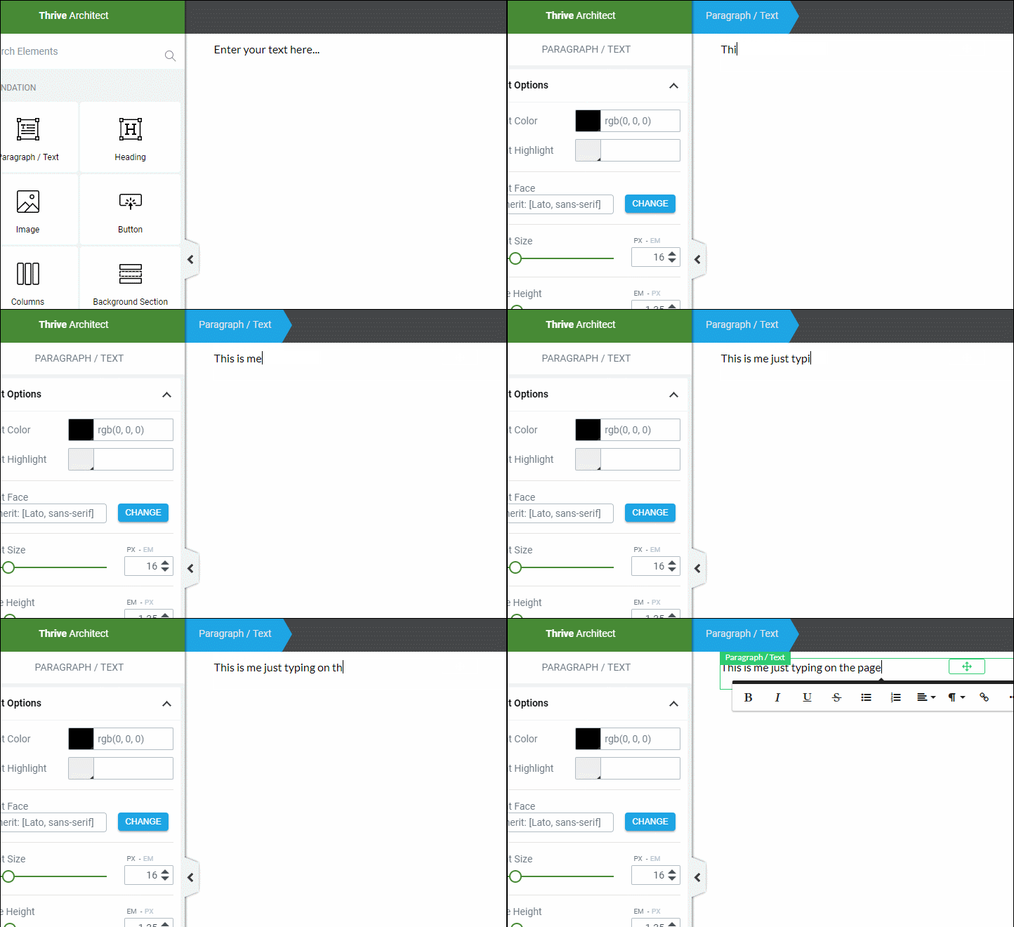
- In-line text editing. You can edit your text directly on the page – no need for a sidebar (like Elementor) or a popup (like Beaver Builder).
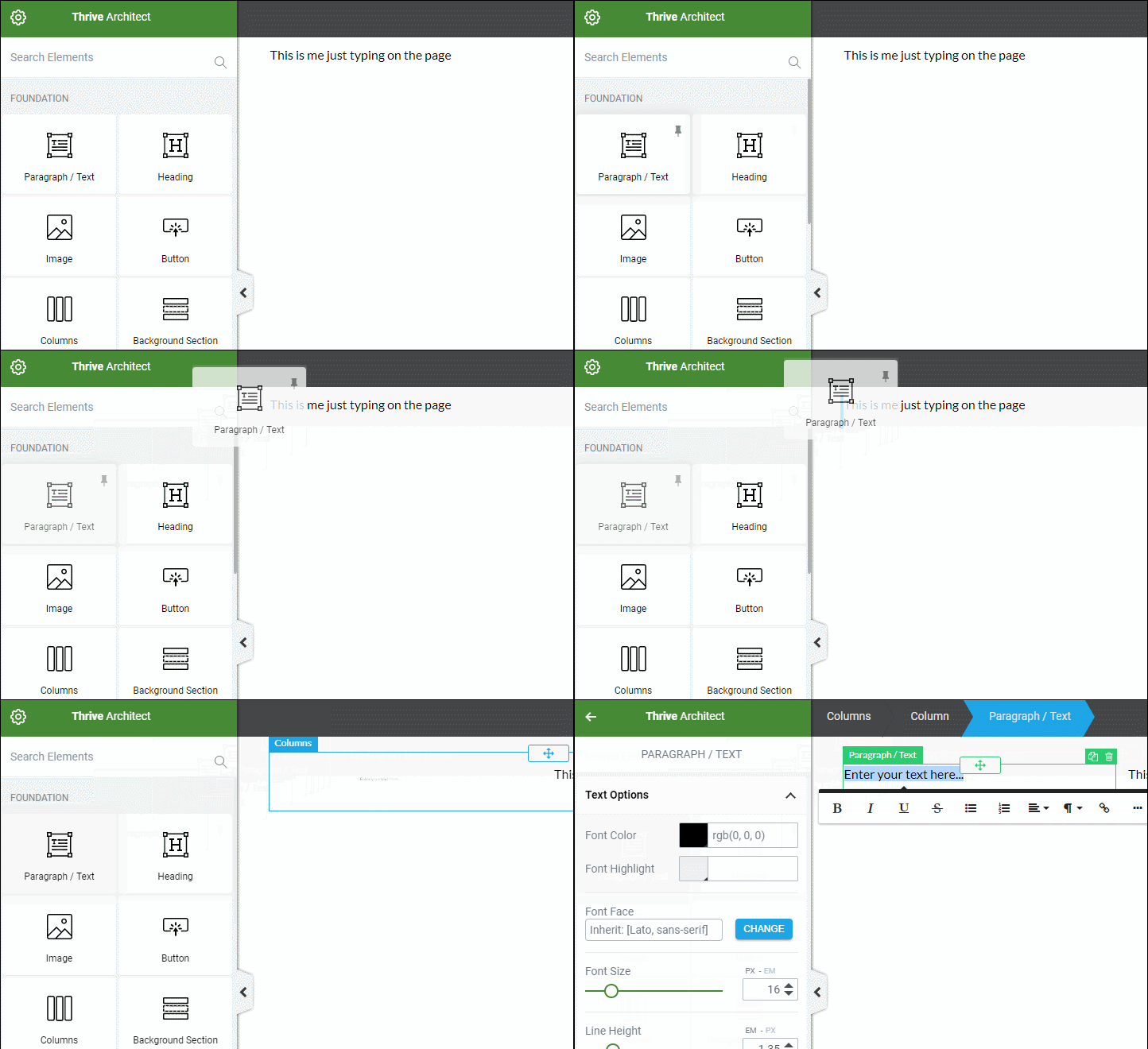
- Drag and drop column creation. You can create a new column just by dragging an element next to another element.
Here’s what in-line text editing looks like in Thrive Architect:
And here’s what I mean by easy column creation:
I know these seem like small features – but over time, each will save you a non-trivial amount of time.
Divi Builder has in-line text editing, but no easy column creation. Beaver Builder has easy column creation, but no in-line text editing.
So by offering both in the same package, I think Thrive Architect does a good job differentiating itself.
A Look At Some Of Thrive Architect’s Most Helpful Elements
I can’t show you every single element offered by Thrive Architect, but here are some of the ones that I think are the most helpful.
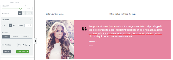
The Testimonials element helps you easily add social proof:
The Table element is especially powerful and can eliminate the need for a separate table plugin for most uses. It lets you build and style a complete table structure:
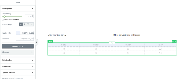
Then, you can drag the other Thrive Architect elements into the table to create your design. This makes it super easy to create pricing tables, comparison tables, and lots more.
It’s not especially handy for huge datasets – but it’s perfect for most small tables that sites use.
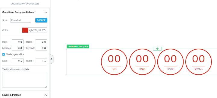
You also get two different Countdown elements – one for a standard countdown timer and another for an evergreen countdown:
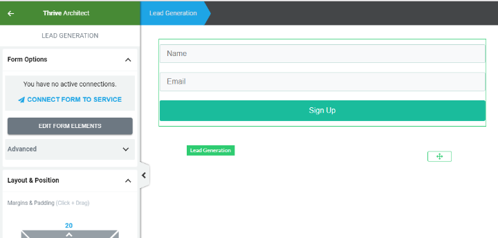
And you also get a Lead Generation element to help you build an email list and connect with a number of popular email marketing services:
Styling All Of The Thrive Architect Elements
As I mentioned, in comparison to Thrive Content Builder, Thrive Architect gives you more control over each element that you use on your page.
Unlike many page builders, Thrive Architect puts all of these options in a single column, instead of utilizing multiple tabs:
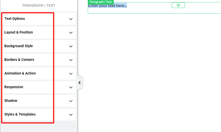
I actually prefer this approach because I find it quicker to work with.
You really do have a ton of control now. Listing every single styling option would take a while, but here are some of the highlights:
- Take full control over colors/typography
- Easily add custom margins/padding to move an element around
- Change floats and z-index for more positioning
- Change backgrounds
- Add borders and corners
- Add animations
- Turn elements on/off for specific devices to help with responsive design
- Add custom CSS classes/IDs
And for some elements, you can repeat the same styles for different hover states. This gives you full control over what happens when a user hovers over an element:
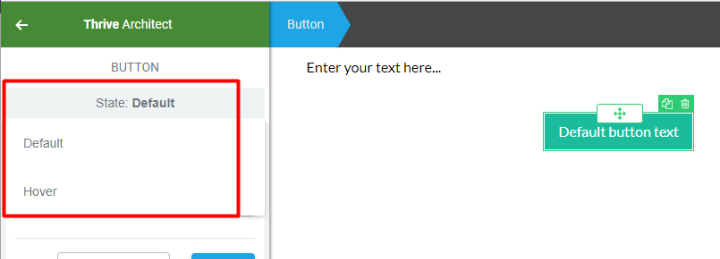
Now, if you just want to quickly build out a layout, you might not necessarily take advantage of all of these styling options every single time.
But – it’s awesome that they’re available if you want them.
Using Pre-Made Templates With Thrive Architect
One of the major attractions of Thrive Content Builder was its huge collection of landing page templates.
Those haven’t gone away – you can still import them as needed via Thrive Architect:
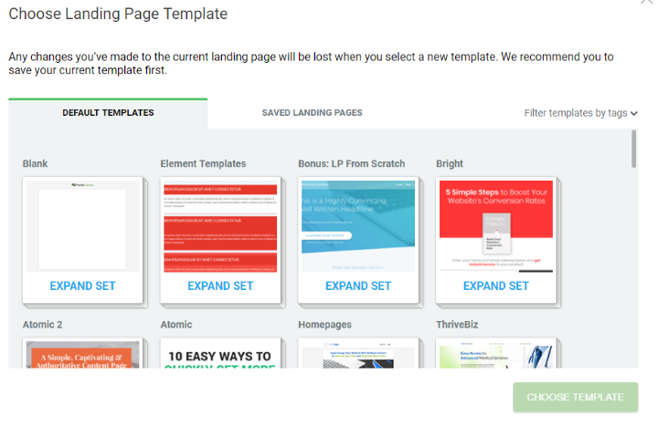
Honestly, some of the landing page templates still look a bit dated, especially when you compare them to the beautiful templates that the Elementor team is pumping out.
But you have a ton of select and can usually find something that at least works as a baseline.
How Much Does Thrive Architect Cost?
You can purchase access to Thrive Architect in two different ways.
First, you can purchase the standalone plugin starting at $67 for a single site license and unlimited updates.
Second, you can purchase the Thrive Themes Membership starting at $19 per month (billed annually). This gets you access to every single Thrive Themes product. If you’re a serious marketer, this package may well offer you better value.
Should You Use Thrive Architect?
I always liked Thrive Content Builder – it’s what I used on my portfolio site. But as much as I enjoyed it, there’s no denying that it had become dated.
Since its initial release, Elegant Themes released the visual Divi Builder and Elementor quickly chomped up market share. Plus, you still had Beaver Builder out there being awesome.
Thrive Architect is a major upgrade that puts Thrive Themes back in the conversation with those other page builders.
The new styling options are awesome and I feel more confident using it now that there’s no more shortcode lock-in. While it might not have as large a community as Divi Builder, Elementor, or Beaver Builder, I think it’s a high-quality page builder that can absolutely help you build conversion-focused pages as quickly as possible.
So if you’re in the market for a new WordPress page builder – definitely give Thrive Architect a look.


Hi! How I can edit content width in the post?
– In post have 4 templates and I like best is the narrow template but It’s so narrow how I can edit content larger. I see Thrive Theme support custom code from header, body to footer and css below the post. Help me, please. I hope helped. Thanks
That’s the Worst landing page plugin I have ever seen in my life, Never recommended.