Ever wished that you could build your entire WordPress theme with a drag-and-drop visual editor?
What was once merely a dream is now becoming more accessible thanks to tools like Beaver Themer, Elementor Pro 2.0 and – the subject of today’s review – Oxygen 2.0.
Oxygen 2.0 is a visual drag-and-drop website builder for your WordPress site. Via its powerful editor and templating system, it gives you the power to build literally 100% of your WordPress site using visual design.
We actually previously reviewed Oxygen 1.0 back in June 2017, but now the developers are back with a massive update in the form of Oxygen 2.0. Keep reading my Oxygen 2.0 review for a look at what this revamped tool can do.
Oxygen 2.0 Review: How It Works
You’ll see this a lot more in-depth over the next few sections, but here’s a quick summary of Oxygen 2.0’s basic functionality. You can…
- Build templates to control how your entire site looks using a visual drag-and-drop editor
- Create individual pages or reusable parts using the same editor
- Easily apply CSS selectors to elements and work directly with your own stylesheets
- Use responsive controls to set different styles for different devices
- Bring in content from plugins – like a form or an event calendar – and style it using the same Oxygen visual interface
- Control layouts using simple column-less settings and with draggable spacing
How Is Oxygen 2.0 Different Than A Page Builder?
Drag and drop editing…visual design…Oxygen is just a page builder, right?
Well…kind of. But there are also some important differences.
First one – it completely replaces your theme.
I don’t know of any other page builder that does this.
Even if you use Beaver Themer or Elementor Pro 2.0, your WordPress theme still plays a role and you’ll see it in your site’s code.
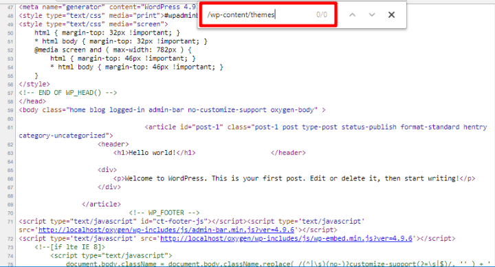
But Oxygen really does completely eliminate your WordPress theme from the equation. Even though you still need to technically have a theme active, you’ll see no trace of that theme in your site’s front end code:
Second – Oxygen’s templating system is way more detailed than you’ll get with a page builder. You’ll see this more in the hands-on section.
There are plenty of smaller differences, as well – but those are the two that stick out to me.
In fact, you can still use your favorite page builder with Oxygen – the two are not mutually exclusive tools. For example, you could use a page builder to design the content that goes inside the Page template that you build with Oxygen.
How Oxygen 2.0’s Templates Work
To control how different content on your site looks, you use templates. If you’re familiar with how WordPress themes work, you should grasp this concept pretty quickly. But if you’re not, it might take a little to get up-to-speed.
A template dictates how specific content looks. For example, if you build a template for a single blog post (like the post you’re reading now), you’ll use Oxygen to specify:
- Where the blog post title goes
- What author meta information to include and where
- Where the blog content goes
And you’ll also add styling for all those elements.
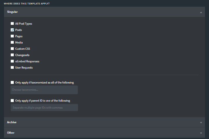
Then, you can choose exactly which posts to apply that template to. For example, you could create a single template for all posts. Or, you could create a special template for a specific category of posts:
Simple enough so far, right?
Here’s where Oxygen’s templating system gets pretty cool, though:
Template Inheritance
First, you can have templates inherit from other templates. This opens up a lot of flexibility.
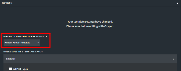
For example, you can create one template that includes your site’s header and footer. Then, rather than having to manually add your header and footer for every content type on your site, you can just have other templates inherit the header and footer template.
Essentially, this lets you use those subsequent templates to only design the content that sits in between the header and footer.
Not only does this save you time in the present, it also means that if you ever need to change your header in the future, you only need to edit your header/footer template one time:
Template Priority
In the example above, I said you could have:
- One template for all posts
- One template for a specific category of posts – say the “Photography” category
But there’s a problem with that, right? If you set it up like that, posts in the Photography category would have two templates that apply to them (because All Posts would also apply)
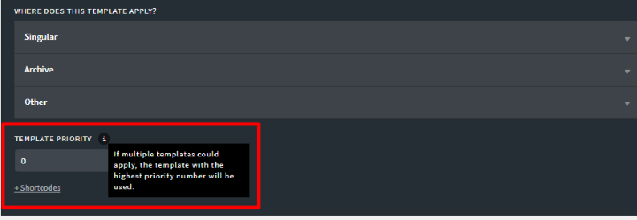
To avoid this conflict, Oxygen 2.0 lets you set up Template Priority. Essentially, this lets you dictate which template should “win” in such a situation:
Again, this is another way in which Oxygen makes things pretty flexible.
Using The Oxygen Editor To Build A Template
To actually build your templates, you’ll use Oxygen’s visual editor, which has gotten a complete revamp in Oxygen 2.0.
When you build a template from scratch, you’ll see a blank editor to start. But if you’re inheriting from another template, you’ll see the inherited template around the buildable area.
On the left, you can use the sidebar to add elements to your design:
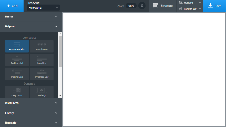
These elements are divided into five different sections:
- Basics – simple building blocks like sections, text, images, etc.
- Helpers – more advanced building blocks, as well as tools to help you build your header, post grids, and more.
- WordPress – these let you insert WordPress-specific elements. For example, you can insert menus or sidebars. Or, you can insert any information from your WordPress database – like a post’s title, author information, etc.
- Library – Oxygen 2.0 includes pre-built design sets that you can import designs from to save time.
- Reusable – you can also save your own designs as reusable parts and then access them here.
If needed, you can also bring in content from other plugins that you’re using, as well.
Building Layouts Using Oxygen
One of the areas where Oxygen 2.0 excels is its flexbox-based layout engine. It has a couple of features that make building layouts easier than your average page builder.
First, each section has these Child Element Layout and Horizontal Item Alignment settings. These let you do two cool things:
- You can create horizontal layouts without needing to set up columns (though there is a column element if you want it).
- You can set the alignment for all the elements in a section without needing to edit each element individually
To demonstrate this, I added three elements to my design. Watch how easy it is to manipulate them:
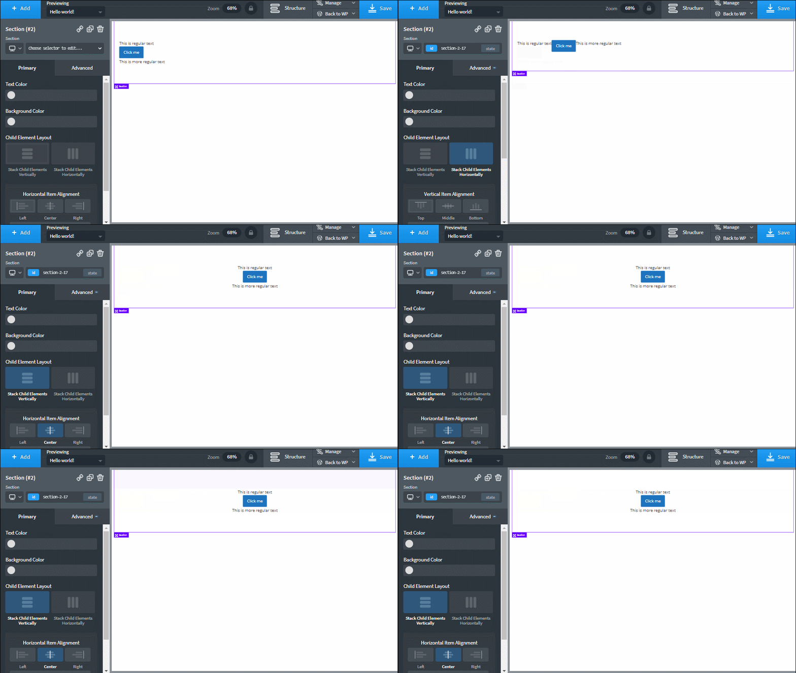
Pretty simple! But there’s still that odd spacing where each element is mashed up against the other one. And that brings me to another part of Oxygen 2.0’s layout system that I like…
Rather than needing to manually adjust padding and margins*, you can just click and drag to adjust spacing. Watch:
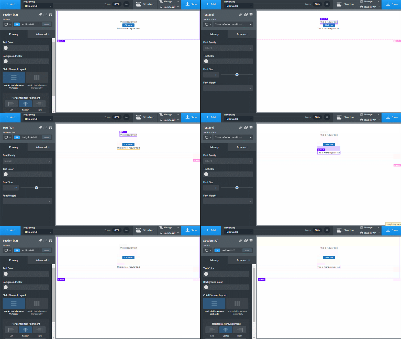
That’s another really convenient way to speed up your workflow. And it’s not just for spacing either. You can also, for example, adjust the size of a button:
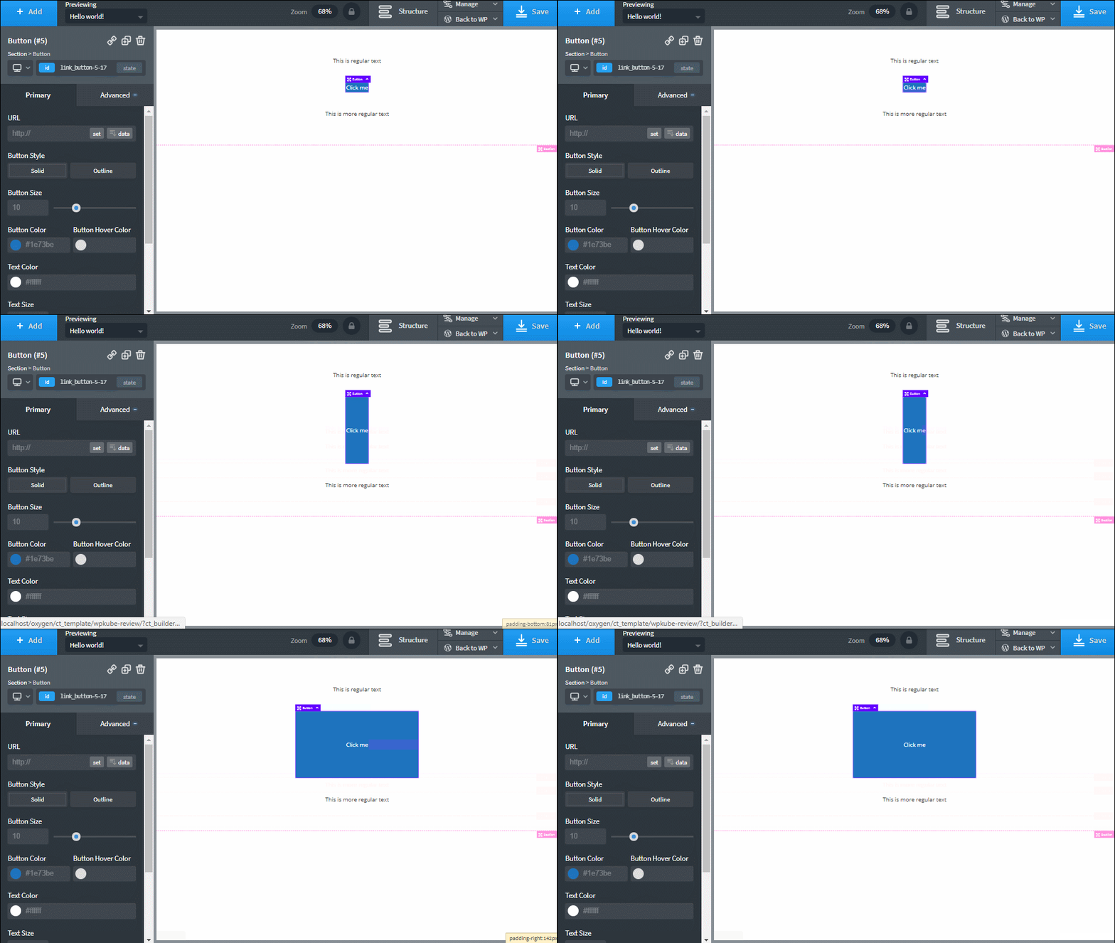
*You can, of course, directly access margins/paddings if you want.
Rearranging Elements In Your Layouts
If you need to rearrange elements in your layouts, Oxygen 2.0 now has drag-and-drop editing. So one way to rearrange them is to just click and drag.
Another way is to open the Structure tab, which shows a full DOM Tree for your design, including divs:
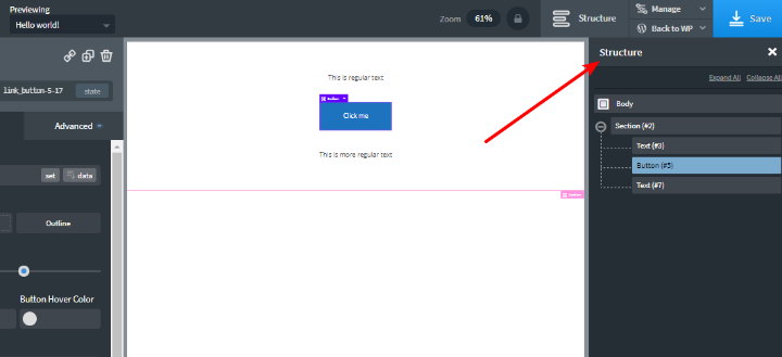
I find having access to the DOM tree really convenient. The Thrive Architect page builder includes a similar concept and I find myself using it all the time to switch between elements and their containers.
Styling Elements And Sections
As you kind of saw in the screenshots above, you style your elements using the sidebar.
In the Primary tab, you can set up all the basic details for an element:
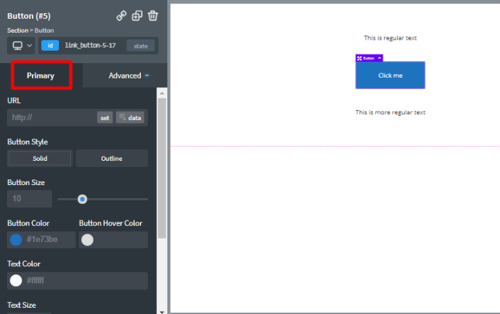
And then the Advanced tab gives you a lot more settings:
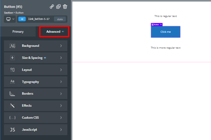
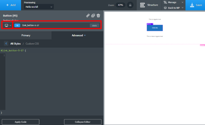
And one thing developers will love is how accessible Oxygen 2.0 makes CSS.
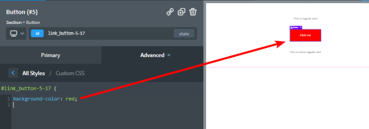
You can use the controls at the top to select different media queries and apply CSS selectors. And then you can directly work with CSS using the full editor:
All your code is applied in real-time:
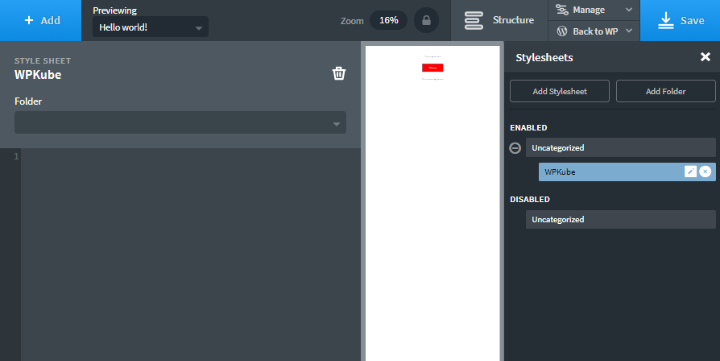
And you can also directly edit and create your own stylesheets:
And there you have it – a whirlwind tour of the new Oxygen 2.0 experience!
How Much Does Oxygen 2.0 Cost?
Though the developers stress the current price is “limited time introductory pricing”, right now Oxygen’s price is hard to beat, especially if you’re building sites for clients.
For now, you can buy Oxygen 2.0 for $99 for use on unlimited sites. And that includes client sites.
Better yet, you also get lifetime support and lifetime updates. So it’s $99 all-in for life.
Final Thoughts + Who Should Use Oxygen 2.0?
If you just want a solution to help you build pages inside your existing WordPress theme, Oxygen 2.0 is not for you. Stick with a more traditional WordPress page builder.
But if you’re building complete websites for clients, or if you’re the type of person who wants to build your own WordPress site from scratch, Oxygen 2.0 is made for you.
As someone who’s used both Oxygen 1.0 and Oxygen 2.0, Oxygen 2.0 feels like a big improvement, which is always a good thing (read my original Oxygen 1.0 review for a comparison). The inclusion of drag and drop editing makes it feel a lot more intuitive. And they’ve made it a lot speedier to build content by reducing the need to rely on custom code as much as before.
Additionally, I love the way the new layout engine works – draggable spacing and sizing is really convenient.
All in all, if you’re looking for a flexible, cost-effective way to build entire WordPress websites, I think you should give Oxygen 2.0 a look.
There’s a 30-day money-back guarantee, so you’re not risking anything by giving it a try.


Colin Newcomer, thanks for the article post.Really thank you! Great.
Nice plugin but with only 60 installations and almost 1 year for the last update it won’t be easy to use oxygen instead of siteorigin page builder !!
That’s the free version of Oxygen you’re talking about, which is a stripped down version of 1.x. We need to give the free version of Oxygen some love, but right now we’re focused on the 2.0 pro version which has thousands of users.
I do agree with Sami statement when a builder takes over one year to provide updates, and then focus primarily on clients other than the community, it reminds me of most Envato developers that start well, then slack on further releases just because they secured a fanbase.
It should follow the concept of Elementor, that sees for paid and community users equally other than prioritising.
As someone who JUST discovered Elementor 2.0 has a Theme Builder, and watched a video so am now totally informed (not).
Can you clarify how this could be better for someone like me that wants Clean-CSS design control, but would also like to churn out existing designs I like as quickly as possible?