The custom WordPress login page is not a new concept, but plugins have come and gone, clearing the way for some of the nicer designed custom login page options. That said, I want to show you how to make your own custom WordPress login page with the help of the Caldera Custom Login plugin.
This is a premium plugin, but in my comparison you receive some wonderfully intuitive tools for quickly uploading high resolution photos and changing just about every color option on the login page–which is often not achievable with free login page plugins. To start, go to the Caldrea Custom Login plugin website here and download the tool. Keep reading to learn how to implement the custom login page.
How to Create a Custom WordPress Login Page
Step 1: Install and Activate the Caldera Custom Login Plugin
In your WordPress dashboard, go to Plugins > Add New and navigate to the Upload Plugin button. This next page provides an area for you to click on the Choose File button, which opens a page to find the plugin file on your computer. Look for the file, wherever you place it on the computer, and select it to bring onto your dashboard.
This is a zip file, so you shouldn’t have to unzip or pull out any of the files inside the zip in order to upload it. Click on the Install Now button to proceed.
A new page comes up where you can click on the Activate plugin link to make the plugin start working on your website.
Step 2: Finding the Settings to Start Your Design
The next step is to locate where you will be changing settings and modifying what you want your custom login forms to look like. Scroll over the Appearance button on the left hand side of your WordPress dashboard. Select the Custom Login option to move forward. As long as you purchased the plugin from the Caldera Custom Login website you don’t have to register the product on your WordPress dashboard.
Step 3: Customizing the Login Page Main Panel Settings
The first tab to look at is titled Panel, where you can start by changing the Page Title and Logo. For this tutorial I am managing the login page for my own personal portfolio, but I can see developers using it for all of their clients. So, you would change the Page Title to the company name. Click on the Upload link next to the Logo field and select the custom logo you plan on displaying. This works great for branding and even for keeping track of your own clients when logging into their backends. Feel free to select a thumbnail or full size image for the logo.
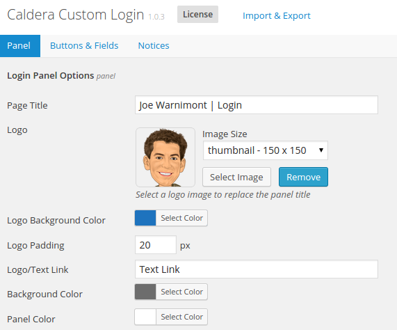
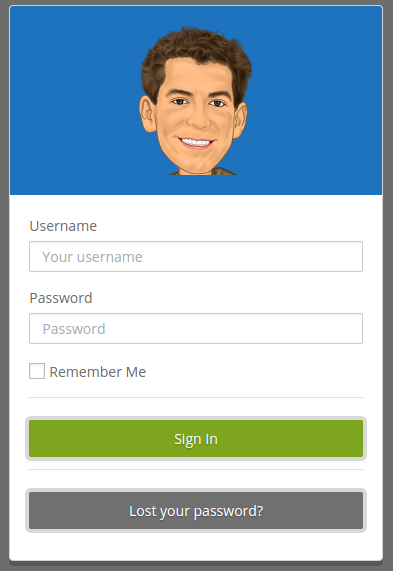
Scroll down to the modify the Logo Background Color, Logo Padding and Logo/ Text Link. The background color only surrounds the logo, the padding changes how far that logo extends and the Logo/Text Link lets you paste in a link if you want people to be redirected somewhere when clicking the logo. This may be towards the site frontend or to your support pages if you’re running a website design company.
As we scroll down a bit on the Panel page, you’ll notice a couple options for including even more photos on the login form. The Panel Background Image takes all the area behind your username and password fields and fills it in with a photo. Play around with different photos, but I found that the less detailed the image, the better, since it gets covered by text and fields, so an image of people wouldn’t really show up that well.
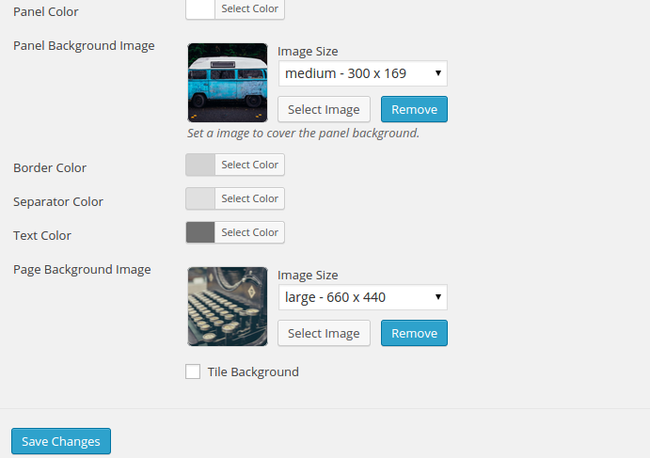
You can also change around the border, separator and text colors to help distinguish between the panel image and the background image. I found that it looks fine by leaving the default settings, but I can see plenty of organizations toying with the colors to make it look just right.
The final, and most exciting image upload feature is for the background. I’ve worked with a few other login page customization tools, and a few of them had difficulty because they either stretched out the image too much or forced the image into a tiled effect, depending on the size and resolution of your background image.
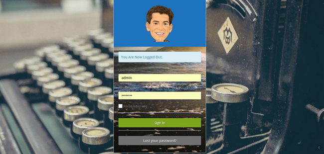
The Caldera Custom Login plugin worked well with just about all of the images I tried to upload as backgrounds. Grab a larger photo from your computer and upload it to the dashboard. You can choose to modify the image sizes on your login page. For the logo I would stick with the thumbnail size. The panel background image is best suited with a medium size, and the page background image looks fine with either a large or full-size setting, depending on the size of the original image.
Feel free to see how the tiled background setting works for you, but in my opinion this always makes a page look cluttered and distracting. After you’re done uploading your photos and moving around your color settings, click on the Save Changes button to move on.
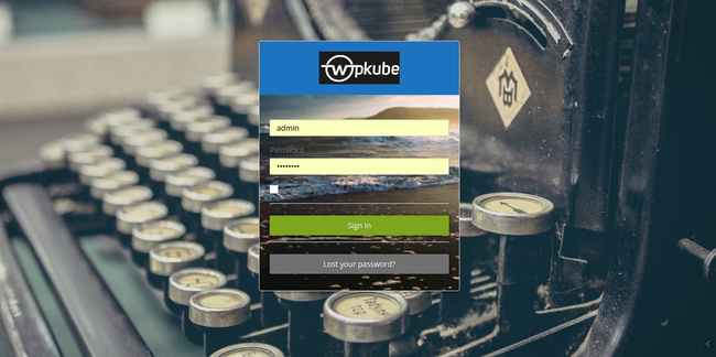
Unfortunately, the plugin doesn’t offer an in-dashboard preview button so you must log out of your WordPress dashboard whenever you make a change and want to view what it looks like. So, log out of your account to see what happened on the login page. As you can see, it really depends on which images you upload to the login page, as many photos clash. However, a simple border tweak or photo change allows for a more pleasant layout.
Step 4 : Modifying Buttons and Fields
Click on the Buttons and Fields tab to view a long list of color settings. These range from the login button background to input border color.
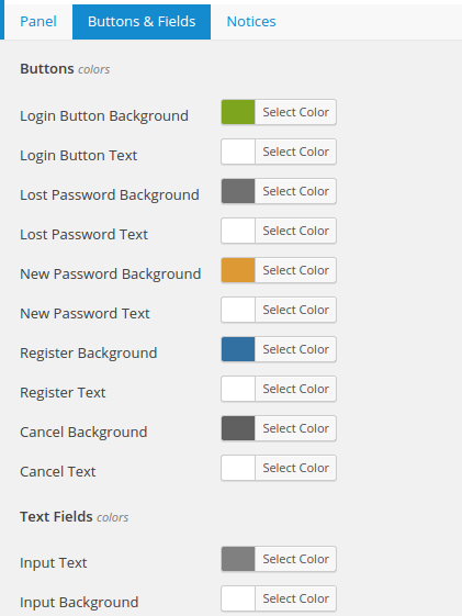
Once again, this all depends on what type of branding you are going for, so pick and choose based on your design preferences. All you have to do is click on the Select Color button and choose from the color scheme provided. The plugin also provides a field for pasting in a predetermined color code.
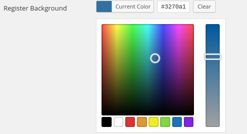
Once you’re done creating the perfect colors for your buttons and fields, click on the Save Changes button and log out of your WordPress dashboard to view the changes.
Step 5: Setting Your Notices
The Notices tab is fairly similar to the Buttons and Fields option, since it’s just a list of color settings for you to click on and modify. The info notice is for general notices, while the error notices popup when you don’t login with the right credentials. Once again, the defaults are often suitable, but feel free to generate your own colors.
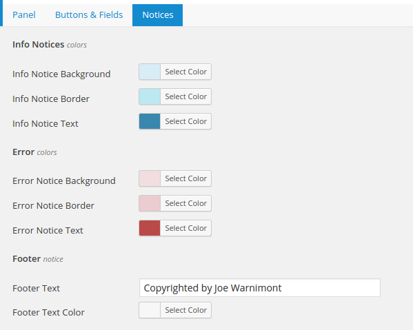
The final setting on this page entails the footer. Type a statement in the Footer Text field if needed. You may use this for copyright information or even for including contact details if you run a website design company and want your clients to always remember how to get in touch with you. After choosing your footer text color, select the Save Changes button to proceed.
Step 6: Importing and Exporting Content from the Caldera Custom Login
The Caldera Custom Login plugin has an extra link at the top of the settings page to either import or export content. This handy feature is actually one of the major highlights, since I’m assuming many website designers will want to create similar login pages for their clients.
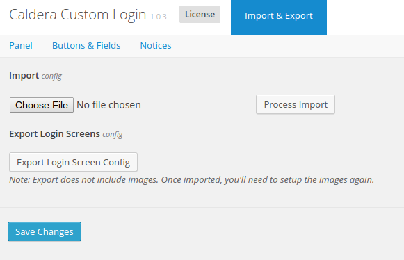
Instead of modifying settings for every site, export the design from your first website and import the file to your other client dashboards. Unfortunately, the export feature does not include any of the image files we talked about in the earlier steps, but as least you can transfer over the color selections.
A Quick Review on the Caldera Custom Login Plugin
I enjoy a nicely designed custom login page, because it breaks up the monotony of the old WordPress logo and plain background you see everyday. Aside from personal preferences, the Caldera Custom Login plugin serves website designers well, because branding is a huge part of generating business and making life easier for clients.
The Good
The Caldera pugin is easy to find in your WordPress dashboard, and the settings page only displays three extra tabs for quick navigation. Even the least knowledgeable designer in the world would find this plugin rather rudimentary. All the color and image customization features are included, as expected, and the photos don’t get all stretched out or strange looking. Not to mention, you can help distinguish between photos with borders and darker or lighter color schemes.
The Bad
I’ve yet to figure out why my footer text doesn’t show up on my login pages. This is a nice branding or message opportunity for design companies, but it doesn’t seem to work for me. The export feature leaves photos out of the equation, adding to the amount of work required to transfer a login page design, but this is something that you can’t get around, since a different site requires a completely new photo upload.
My final qualm is the fact that you must log out of your dashboard to preview the changes. An in-dashboard preview panel would serve as a nice addition, since it becomes tedious to constantly log out and log back in.
The Bottom Line
The Caldera Custom Login plugin serves its purpose well, and it refuses to become anything more, and this is wonderful news. Why? Because it’s a simple login plugin, so the users shouldn’t feel burdened down by a dozen settings pages or too many options to play around with.
The login page designs look stylish and comfortable on the page. Web design companies benefit from the plugin by implementing on all client sites. This helps their clients know that they are on the correct login page. Not to mention, the website design companies can even include some of their own branding for marketing purposes.
CalderaWP is a credible plugin company, so if you ever have any questions or problems with the Caldera Custom Login plugin you can send them a message or check out the documentation page.
You can also view some of the other offerings from CalderaWP, including Caldera Forms, the Users for Caldera Forms plugin, and Caldera Clarity (a visual layout builder) for FacetWP (15% off coupon).
If you have any questions about how to make a custom WordPress login page with the Caldera Custom Login plugin, drop us a line in the comments section below.







Leave a Reply