With WordPress powering nearly 20% of the top 10 million websites, it’s getting tougher to make your site stand out from the crowd. Even though there are countless premium and free WordPress themes available to give your site a professional look, for many sites, the fact they are using WordPress is almost instantly recognizable. While there is nothing wrong with this, it can make conveying your individuality to the world a little more difficult.
Those unfamiliar with WordPress sometimes dismiss the platform by proclaiming that all sites look the same, with a boxy design and predictable sidebars. While this isn’t the case for all sites, there is an element of truth to this. However, it doesn’t have to be this way. To give you some inspiration when creating or choosing your next WordPress theme, here are some sites that break out of the traditional constraints, while still retaining the excellent features and functionality that has made this platform so popular.
Yeti Spotter

The homepage of this site does very little to giveaway the fact that it has been built using WordPress. Nothing above the fold gives any indication that this is a WordPress site and even when you scroll down to the end of the homepage, there is no widgetized footer to give the game away. The developers of this site have create a true one-page theme for WordPress that uses very little of the functionality of this popular CMS to great effect.
Visit Site
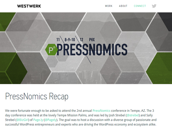
Westwerk

This design agency were actually the creators of the Yeti Spotter site, so it’s no surprise to learn that they have built their own website using WordPress, while ensuring it looks nothing like a standard WordPress site.
The homepage does little to give away what is powering this website, and the same can be said of the individual posts. There are no comments, sidebars or widgets in use here, just great design and well-presented content.
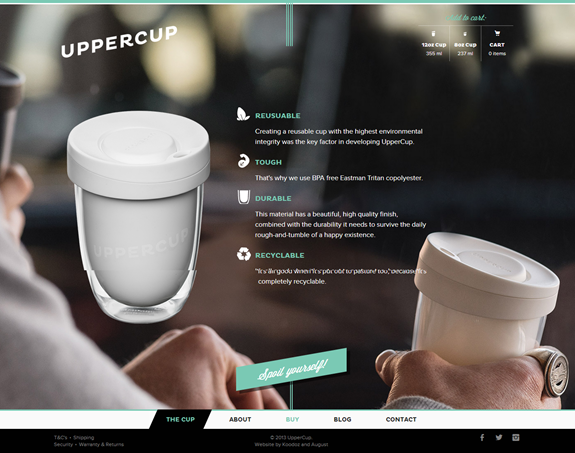
UpperCup

This site has been built to promote and market an innovative reusable coffee cup and the web designers responsible have crafted a custom WordPress theme which perfectly matches the product. Even clicking through to the blog does little to give the impression this is a WordPress site.
The blog features a grid layout of the latest posts which when clicked, displays the post content below the menu. This is a very non-standard approach to display blog posts in WordPress and it works very well. There are no sidebars, widgets, categories or tags on display at the blog, but the content is still easy enough to navigate and make sense of.
The site also features a shopping cart to purchase the UpperCup and as you’d expect, this procedure bears little resemblance to checking out on an eCommerce store powered by an off the shelf WordPress theme.
Protest

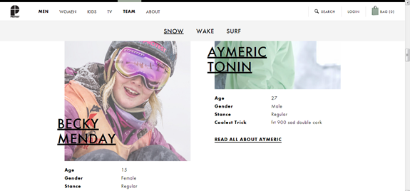
This eCommerce site is a great example of an online store powered by WordPress that doesn’t look like a WordPress site. The store is for a board wear company and the design fits really well with the purpose and target market of the site.
The homepage looks nothing like a WordPress page and the inner pages also do nothing to give away this fact. If you scroll down the end of the long form content you will find some footer widgets. However there is little else of the standard WordPress functionality on display.
Films de Weil

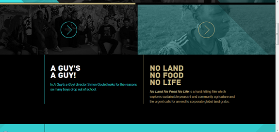
This is another great example of a site that pushes the boundaries of what a WordPress theme can look like. Although it’s a fairly traditional website in terms of the type of content displayed, it’s all been done in a way that hardly resembles a typical WordPress website at all.
The site features full width background videos, bold typography and an eye-catching colour scheme, all used to great effect. There are no sidebars and widgets here, but plenty of good design with the content taking centre stage.
Visit Site
Write for Rights

This site for an Amnesty International project uses WordPress for its backend but makes little use of its more popular front end elements. The design is responsive and makes hardly any use of scroll bars where possible, opting instead to resize the content to fit the screen it is being viewed on.
Sometimes it feels as though the lack of sidebar menus makes it a bit tricky to navigate, but overall the user experience isn’t really negatively effectively by the unconventional design.
Healthy Enough

While the other sites so far have been built as more traditional websites, despite their unconventional use of WordPress, this site is a blog. Unlike the other sites here, the design of Healthy Enough has gone in totally the other direction and embraced the ultra-pared back style, favored by minimalist bloggers like Leo Babauta and his Zen Habits blog.
The Healthy Enough blog does away with sidebars, elaborate menus and simply lets the content be the main focus of the site. As what must be a first for a site that occasionally covers food and cookery, there are no images in use here. A fair amount of screen space has been devoted to capturing email addresses, but there is no place for comments on this site, which is a bold move for such a blog.
Will this minimal design be the next trend to sweep through WordPress web design as bloggers looks to stand out from the crowd and let their content be the main focus of their readers’ attention?
Ghosthorses

The website for UK design firm Ghosthorses makes a big impact and despite not looking totally unconventional in appearance, it doesn’t look like any of the WordPress themes available to buy off the shelf.
A bit more exploration of the site does reveal a few WordPress staples, such as footer widgets and an image slider, but the site deserves a mention here at is eschews many of the stereotypes of this platform, doing away with boxy design and hefty sidebars.
Voile Blanche

This site for the Italian Voile Blanche fashion brand features a strong image-grid homepage layout, which itself isn’t an uncommon design amongst WordPress themes. However, this site does it in a way that removes many of the standard WordPress distractions such as sidebars and footer widgets to create a site that you would have no reason to believe was built using this platform.
Guerrilla Web

This website for the Canadian digital agency Guerrilla Web uses a WordPress theme that offers something new while still retaining lots of the features that make this platform so great. So while you won’t be surprised to discover that this site does in fact use WordPress, you should be pretty impressed with the design vision required to create it. With a fully responsive layout and menus, the bold use of colours and images helps create a memorable impression that will help ingratiate the agency to potential clients.
Conclusion
What do you think about the growing popularity of WordPress and the potential homogenization of the internet? With one in five sites powered by WordPress, a growing sense of familiarity is going to be hard to avoid when creating a website.
Do you think there are enough different styles of themes available and are individual designers doing enough to break the mould in terms of page layouts and theme design?
What sites do you like that use WordPress but don’t look like a typical WordPress site?


WOW!
Impressive collection and well done all!
Have a look at a couple we did.
stonehousephotographic.com
team-prime.com
Love WordPress 🙂
Those are great sites Anil.
I like WordPress, have only just begun looking at the things that are possible with it, though. So I really appreciate a collection of nice looking website created with it. Thank you!
I do think that wordpress is indeed flexible enough to provide space for designers to do with it whatever they please, to guarantee a great variety of different website styles. I’m very impressed to see what some people can do with it!
But even though wordpress has a large and ever growing community, other systems will keep existing, new ones will come up, it’s a constant development. While wordpress is pretty much the biggest system that’s currently out there, it doesn’t mean that it’ll stay this way.
WordPress is easy to use, but creating themes can’t be done by just anybody. I think the future looks more like that: There will be different systems, (smaller systems) and depending on what you want your site to look like, you will choose a system that makes it most easy for you to create the design you want… Designers focussing on wordpress will be able to create the sites they want with it as well, the system does provide that, it’s this huge system though in the background, that might not always be necessary…
~just some thoughts~
I’m curious to see what websites will look like in 10 years! I mean if we look back on the first websites that were out there, when there was only html for styling, and sites were created using frames, for example, things looked very different – and that wasn’t eons ago… development is fast.
Thanks for the shout-out Joe! Great post, keep up the awesome work. Let us know if we can be of assistance or inspiration in the future 🙂
This is a great colletion. We’ve recently built our WordPress site at neodevsolutions using Headway in an attempt to not look so WordPressy lol
I’m running a marketplace for musicians that’s called 10beats.com and it doesn’t look like wordpress at all.
10beats.com
(Sorry for the self promotion… not my thing but thought it’s worth sharing)
What would have been a really useful addition to this article ? A mention of which theme had been used, whether it is available for purchase, and the level of customisation. Looking forward to a followup … ! 🙂
Most, if not all of the themes featured were custom builds. I don’t think they are for sale.
Thanks for the post and great to see these sites. Would agree that they look very different. I too am currently having a change in my website & a complete new CMS is being created to showcase a travel company on my WordPress site. The new theme should go live in over 10 days time & hopefully should create some good interest 🙂 thanks for posting !!
I think Guerrilla Web looks pretty WordPressy, with those big, chunky, rectangular, boxy menu tabs/buttons/items at the top. That is a #dead giveaway.
Ghosthorses is on the verge of looking blatantly like a WordPress site. The flat, “matte” if you will, sort of look and all the grey.
Write for Rights looks like a Square Space site.
What they all have in common is that flat, neutral, 2-dimensional, illustrated look. It looks good, but I think it loses effect once it becomes overdone by everyone emulating it.
Health Enough definitely does not look like a WordPress site at first glance. I haven’t yet visited the site through-and-through.
They are all great-looking sites. Very attractive. Love looking at them, and I would love to have a site similar to them. I just can’t seem to activate my creative side anymore. You lose what you don’t use. So true.
I am looking for some inspiration, mentor-ship and assistance with getting my website up and running. If anyone would be interested and wants to know more about it, please e-mail me: char_rock10@hotmail.com
Thanks!
I think that WordPress is winning the cms battle and since a few years there’s a lot of unfamiliar themes that are designed to don’t just look like a blog.
Certainly in the course of the next years, web designers will continue to create different styles of themes with new page layouts and theme design.
Sorry,
Although everything posted looks good… They still have the look and feel of wordpress. Custom design seems to have “gone with the wind”.
For the difference in development time and even pricing, many clients will not care that their site looks vary similar to another persons. Even though I don’t like it, I don’t blame them.
I’ve yet to see a wordpress site that looks unique… Maybe I’m just a bitter “old-school” designer.
i dont understand. ALL these look VERY wordpress.
Cant anyone make a unique non-wp website anymore?
I’m sorry but all of these look exactly like a WordPress page. Endlessly wide, bland colours, minimalism everywhere. It’s a trend now and it’s very boring.