The About page is one of the most important pages on your WordPress blog. Yes, the one where you slapped on some info about yourself a year ago and haven’t looked at since.
Really, that’s important? Isn’t the About page just something every blogger creates out of a sense of duty?
Unfortunately, that is often the case. However, that doesn’t mean it should be that way. If done right, the About page can be one of the main vehicles for building trust and connecting with your audience.
Since it is often neglected, today we will take a look at how to create an About page for your WordPress blog that is a real asset instead of just an obligatory site element.
Why Your About Page Matters
It might come as a surprise, but typically the about page is one of the most visited pages of any blog. It’s true, check your analytics.
Pat Flynn of Smart Passive Income did and found that adding an extra opt-in form to his About page increased his conversions there by 446%!
That’s quite impressive. However, why is this page so immensely popular?
Well, when visitors come to your blog through an article they find interesting, it’s natural to want to know more about the person behind it. That’s just basic human behavior.
And what do they naturally turn to? The page that says About me in big bright letters.
As a consequence, your About page can be a very effective tool for branding and positioning yourself in your industry. And, as we have seen above, it’s also one of the key opportunities to convert visitors into subscribers.
Another advantage is that since this page is already a magnet for traffic, it’s much more economical to optimize its conversion rate than creating additional content. Makes sense, doesn’t it?
In short, the About page is a great tool for building trust and lead generation.
How to Create The Perfect About Page in WordPress
Alright, now that we know why this page matters, let’s go over how to make sure it can do its important work. Use the following tips to set up a killer About Me section or to improve your existing one.
1. Make it easy to find
For anyone to be awed by your About page or to eagerly jump on your email list from an embedded sign-up form, they first need to be able to find it.
Even before that, you actually have to have such a page. Therefore, if you didn’t do so yet, create a new page now. Go ahead, I’ll wait.
For complete WordPress newbies, go to Pages > Add New.
Then add a page name. For now you can simply go with About. We will talk about the title in more detail further below.
Next we need to make sure the page shows up in our website’s menu. (Note: you can do this step last if your about page is currently empty.)
Here, it is important that it is called About, About this blog or a similar clear name in your menu, even if you choose a different page title. Don’t force your readers to think. They should be able to find this part of your site without problems.
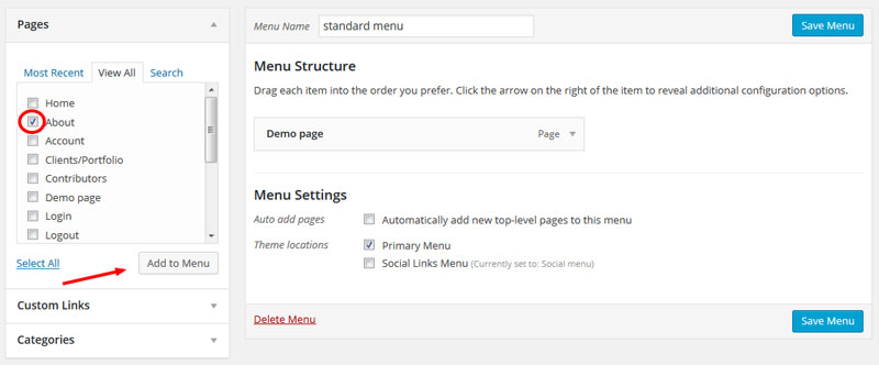
Under Appearance > Menus on the left side of the WordPress admin area, you can not only add your new page to your main menu, but also change the name under which it shows up.
To do so, mark it with a check mark and click on Add to Menu.
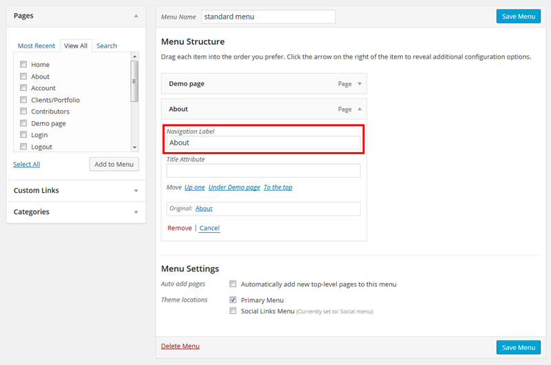
It will then show up in the list on the right. You then have click on the arrow on the right to open the context menu where you can change the title of the menu item.
Don’t forget to save when you are done!
2. Concentrate on the benefits for the reader
Alright, now that we have the page on our site, let’s get to what kind of content belongs on there.
You might be thinking, “Of course I will introduce myself, tell them who I am, give them a bit of my life story, that sort of thing.”
Beep, wrong. Well, sort of.
While there should definitely be information about yourself as a person (or business), that’s not what your visitors most care about.
Why? Because most people are selfish. I don’t mean in a malicious, egotistical-bastard kind of way. Yet, they are selfish in that they come to your blog not for you as a person but for their own benefits.
(Except your mom, she comes to your blog for you.)
The rest, however, will constantly ask the question “What’s in it for me?” in the back of their minds.
Consequently, that’s what the first part of your About page should focus on. If you can answer this question in a persuasive way, why wouldn’t visitors jump onto your email list?
Therefore, you page content should be about the benefits you can provide for others.
That begins with the headline. Most people’s About page is merely called that About. While that is factually accurate, it is a missed opportunity.
How about going with something more descriptive? What do you think will make your visitors prick up their ears more: About me, a person you have never heard of before or How this site will help you do this very thing you are dying to do?
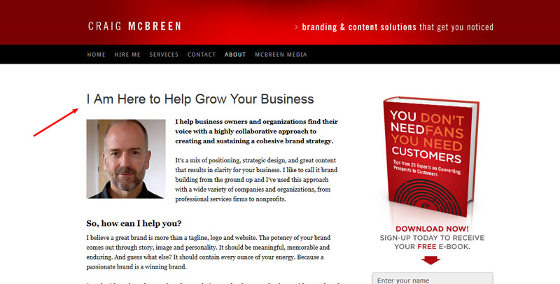
A very good example for this is Craig McBreen:
See how his headline is all about what he can do for others not about himself? This is how it’s done.
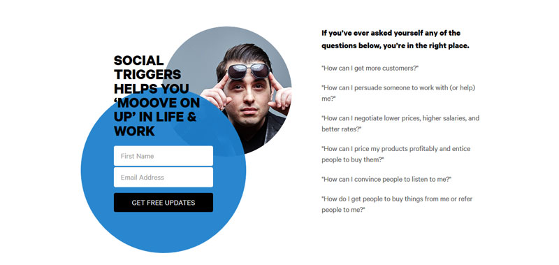
What then follows is a short, equally benefit-driven introduction. Social Triggers does this very well:
Again, concentrate on what others can get out of your site. Be specific, state exactly what potential subscribers can gain from being here. Be brief, no more than a few paragraphs
Focusing on the benefits of your readers will help you attract exactly those kind of people you actually want on your email list.
3. Include social proof
Offering something to your visitors that they are actually looking for is what gets them hooked. However, the next question they will ask themselves is “how do I know this is the real deal?”.
In other words, why should your visitors trust you? So far, they have only have your words.
Therefore, if you can somehow deliver proof for your claims, by all means do it! This will help reassure your readers and give your words additional weight.
Today’s online world offers more than enough possibilities to show that others trust you. For example, the Social Count Plus plugin allows you to display the number of followers on different social platforms.
With OptinMonster you can build sign-up forms that also display how many subscribers are already on your list. A good way to convince more people to hop on there.
In case you are running a client-based website, you can also show off those organizations you work with. Kiwi Logo Carousel is a simple-to-use plugin for displaying client logos including backlinks.
However, what if you are just starting out and have only five Facebook followers to your name? In that case displaying them on your About page will probably do more harm than good.
So, if you don’t have the numbers, you can go with testimonials instead. Share quotes and blurbs from clients, readers and influencers. The Easy Testimonials WordPress plugin will take care of that for you.
But only use real ones. Don’t make them up!
4. Tell your story
Alright, now you can finally talk a little more about yourself, so that your About Me page actually deserves its name.
While they are ultimately on your site for their own benefit, your visitors still want to know about you as a person. Humans want to connect with other people and not faceless corporations. The need for connection is an inherent human trait.
So don’t be afraid to reveal a little about yourself, like whether you are married, have kids, your hobbies, etc. Be human and maybe a tiny bit vulnerable.
However, be sure to make the information relevant in the context of your website. For example, tell the story of how your website came about and your personal journey.
On the other hand, avoid rambling, telling your entire life story or revealing too much. That can be a turnoff, too.
Find a balance so that your readers have a good impression of who you are and what kind of person they are dealing with.
If you want people to learn more about yourself, it might also be a good idea to include links to more detailed posts on your site.
Finally, it’s essential that you include at least one photo of yourself. A pictures says more than a thousand words and all that. Plus, remember the part about faceless corporations? You don’t want to be like that. Be like Pat Flynn instead.
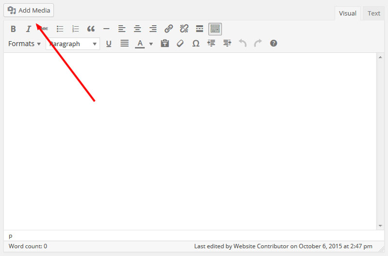
In case you don’t know how to add an image to a WordPress website, it’s quite easy. Just click on Add Media in the upper left corner above the editor window to open the media manager.
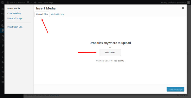
You can upload an image simply by dragging it in there or by clicking on Upload Files, then Select Files and choosing a file on your hard drive.
After it is uploaded, select the image inside the media library, add a title and ALT text, choose alignment, link and size and click Insert into post. Done.
5. Include a Call to Action
As mentioned earlier, the About page is usually one of the most visited pages on your blog and thus one of the best opportunities for conversion. If readers love your content, they might even want to find a way to reciprocate.
Therefore, under all circumstances, add a call to action!
Typically this will be a prompt to jump onto your email list. Depending on your email marketing provider, you might have to use different ways to create your sign-up form.
There are also a number of plugins which can help you integrate forms on your site such as the aforementioned OptinMonster or Optin Forms.
In case you have a different primary goal for the About page (such as getting more likes for your Facebook page, promoting links to your best posts or selling a product) add a call to action for that instead.
Just make sure you have a singular purpose! Collect email addresses or advertise your products. One of them, not both. Don’t confuse your readers. One page. One purpose. Period.
However, that doesn’t mean you can only add your call to action once. According to Derek Halpern, it’s a good idea to display an email sign-up form in several places throughout the page, once after each section and up to three times.
Ready to Create Your Own About Page?
As one of the most visited pages on most sites, the About page is an invaluable tool to build trust, position yourself and generate leads. Therefore, it is crucial to have a page that is properly optimized for these goals.
For a killer About page, follow this formula:
- Easy to find
- Reader benefit driven
- Includes social proof
- Tells your story
- Has a call to action
By paying attention to the above points, your About page will become an effective tool to communicate with your readers and turn it from neglected appendix to information hub and conversion machine.
What does your About page look like? Do you agree with the above? Let us know in the comments.




Do you recommend another Social Count Plugin? Unfortunately it seems Social Count Plus just became unavailable for download April 2020. Thank you so much