Editor’s Note: For those of you, who can’t afford premium plugin such as SeedProd, we recently released a beautiful free coming soon theme called Launch. It comes with MailChimp integration and Live Customizer.
Working on a new WordPress site? Does it have a coming soon page? Would you like to learn how to create a kick-ass coming soon page with minimal effort? You’re in luck, that’s exactly what this post covers.
(If you don’t know what a coming soon page is, and you have a WordPress site you’re working on you’re not ready to show to the public, let me explain why you need one.)
Why is a good coming soon page important? Well, to put it simply, a good coming soon page (also known as launching soon page) allows you to start building followers before you’ve finished your site. Way before you have created enough content, or before your developer has finished all aspects of your site, or your designer has completed his/her finishing touches.
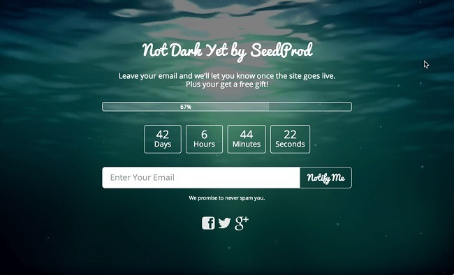
This means you can start marketing weeks, if not months, earlier than if you just waited for the site to get finished before trying to get people to notice your new site.
The reason this is important, is that it allows you to build up a following that will help your actual launch become much more effective. If you manage to get a few hundred people to sign-up just in anticipation of your website, then when it’s finally released, many of them will feel encouraged to share your launch on social media, or even tell their friends about it in person.
Instead of laboring for weeks, or even months, to get a following after your site is already live, this will help put your new site on the map instantly.
Setting Up Your Awesome Coming Soon Page
After you’ve installed the plugin, head over to page settings, and familiarize yourself with the interface. While at first sight, it might seem a little intimidating, don’t worry, it’s straight-forward and intuitive once you get used to it.
1. Activate Email SignUp

One of the first things you should do, is scroll down to form settings, and change the “Save subscribers to:” to whichever autoresponder or email list provider you use. (If you don’t have one yet, you can get started for free with MailChimp or GetResponse).
This step is important. If you don’t offer the visitors that stop by your new website a way of getting notified when the site actually goes live, the chances that they will be back after you do launch are quite slim.
The whole point of a coming soon site is that it allows you to start marketing effectively early on in the stage of development of your new site, and just showing that something is coming soon really isn’t that effective.
This steps takes your coming soon page from a pretty placeholder, to an extremely useful marketing tool.
2. Add Your Logo If You Have One, And Write Some Copy
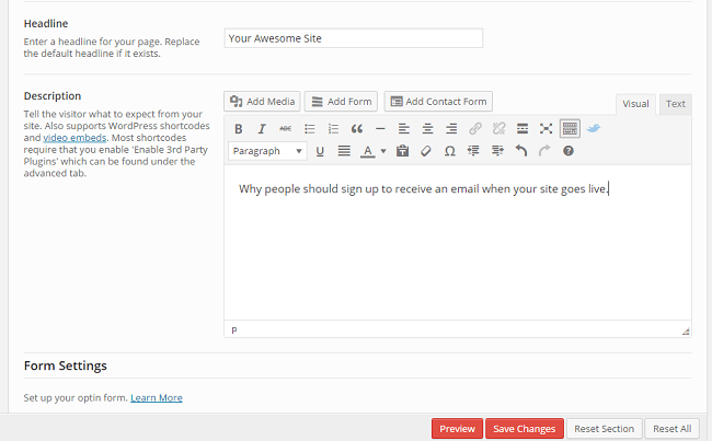
Now, scroll up a bit to content settings, and write a headline and some copy. (At this point, if you’re not exactly an experienced copywriter, or don’t really know what ‘copywriter’ means except that that guy from Mad Men is one, you might want to do a little prep work. You can familiarize yourself with copywriting through this detailed article, take a course, or go the old fashioned route, and read some books).
While design is crucial to a good coming soon page, it will all be for naught if what’s actually written on it doesn’t intrigue your visitors, and inspire them to sign up to get notified when your site goes live.
3. Design, Design, Design
The great thing about SeedProd, is that you can get some amazing looking results, and quickly. Without knowing any code and being barely MS Paint literate.
It does this through the simple, yet powerful design interface.
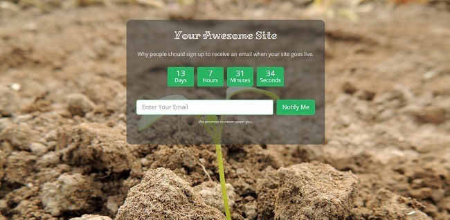
You’ve already seen an awesome example above, but here are a few more examples of what can be done, including the final product of my own efforts:

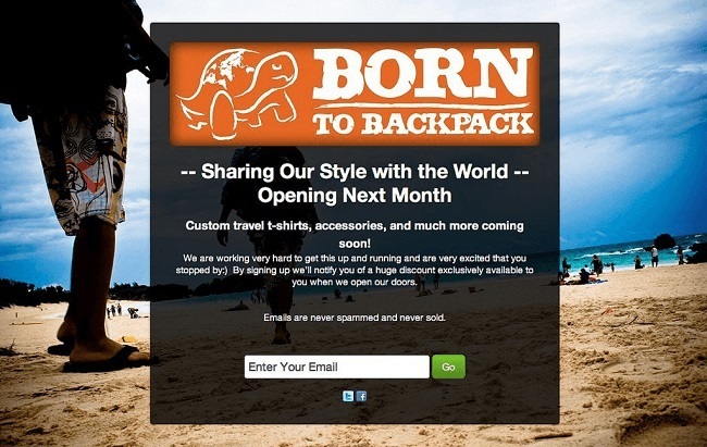
Inspired yet? Good.
First off, let’s activate the standard theme. Head to design settings, and simply click the standard theme and then save the settings. Now let’s take a quick look and see how your coming soon page looks.

Okay, it looks a little bit better, but with a white background it still looks quite bland.
So one thing we can do is find a suitable background image.
What kind of picture you should look for, depends on what kind of website you are creating. I chose quite a zen picture of a sprout growing, because the site I had in mind for this particular coming soon page was about growth.
A thing to keep in mind is that you want to avoid using pictures that require attribution (that you give them a link back to their site when using their work). On a coming soon page, an outgoing link to a photographer will only distract your visitors from what you want/need them to pay attention to. And you don’t want to use the work without proper attribution without permission, only to have your web host take your site down because of a legal complaint from the photographer.
But fear not, you can get images that don’t require any attribution, for free. Some of my favorite websites for this are: Unsplash, Gratisography, and Pixabay, where I found the picture I used for my coming soon page. While these sites work great for some bloggers, others might not be able to find what you’re looking for. They simply don’t have as many photos as some of the bigger marketplaces for paid pictures, and the search functions are often not as intuitive or powerful either.

After you’ve chosen your picture, you need to head back to design settings, under background settings, and upload it, and set it as the background image. Let’s take a look and see what it looks like. It does look better, but we’re still not quite there.
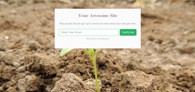
Now, one easy thing you can use to make your coming soon page look more clean and professional, is to change the background color of the container to match with the background image, or even make the content section opaque or invisible.
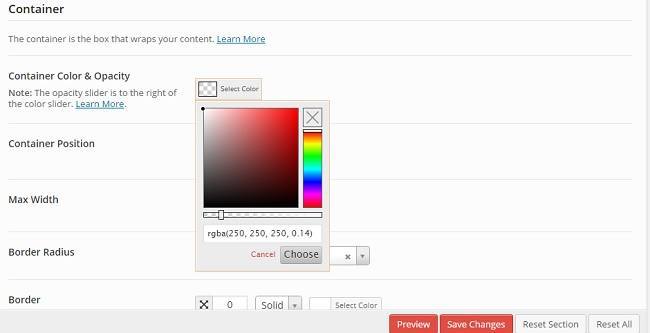
I like my background image a lot, and I think it alone conveys the message of what my site will be about quite well, so I definitely don’t want to hide an important part behind a colored box. But I don’t think the text will be all that easy to read if I go with 100% invisible, so I’m going with opaque. Head down to the content settings, and open up the color picker. The bar at the bottom is the level of opacity.
If you find that the writing is quite hard to read, which happened to me, you can decrease the opacity, and choose a lighter color if you’d prefer dark text on your page, or choose a darker color if you’d prefer light text.
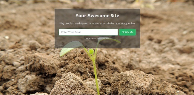
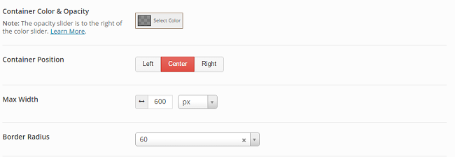
Depending on the picture and page content, you might want to change the position of the content, or round the corners of the container box. You do this by simply scrolling to the ‘Container’ part of the design settings, and changing the container position, or change the value of border radius. If you want visible curves, you should put 20+ at least. (The pictures below are with a value of 60.)
Fonts
Another cool aspect of SeedProd is that it allows you to freely choose from a lot of awesome fonts. If you want to expertly use this to your advantage, you should read this guide on how to pair fonts.
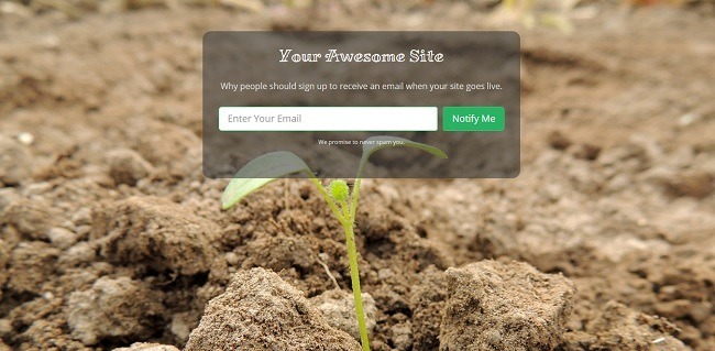
After you’ve chosen your fonts, you can take another look. I ended up going with a font called Miltonian for the headline, and then standard open sans for the body text for contrast.
Progress Bar vs. Countdown

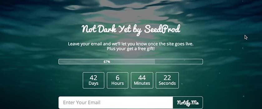
A great thing about having a countdown is that knowing a bunch of people are waiting patiently on your site to launch, can have a real boot-to-the-rear effect when you most need it, helping you move mountains and meet the deadline somehow. One issue with this is that you obviously can’t predict the future, and if you run into a problem that’s impossible to solve in a timely manner, you’ll have to infor your followers that the launch date has been pushed back.
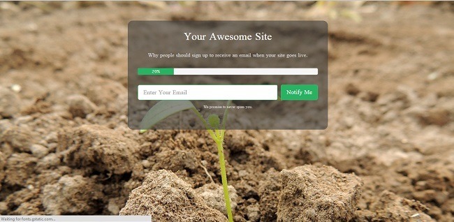
For the progress bar, you can either just keep score of your progress as you go along, or set it to automatically adjust the progress by setting a start and launch date. Both these options are found under page settings.
You Can Also Create Maintenance Pages
One of the many cool things about the SeedProd coming soon pro plugin, is that you can also use it to create a great looking maintenance page for using after your site is live. And with the powerful design interface, you can easily make a great looking one at that.
Some websites and apps that have great customer/user loyalty, take the extra time and energy to make even their 404 error pages, and maintenance pages, continue their brand, often with humor (examples). So adding a bit of pizzaz to your maintenance page that goes along with your site’s vibe can be a good idea.
The maintenance page uses the same interface as the coming soon page, so you just need to edit your page after launch, and then activate maintenance mode when necessary.
Bypass Url Function
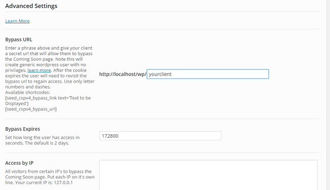
If you want to show a possible client what your site looks like so far, without turning off the coming soon mode, you can create a bypass url that they can use to see and experience the real website, without interfering with the coming soon page at all.
You Can Also Create Landing Pages

Does it feel like a shame, or even a waste, to get to know how to easily create an awesome looking landing page, and then not being able to use it after you launch? Fear not, there’s also a landing page mode, where you set the plugin to only display the landing page on the page of your choice. Found under advanced settings.
All things considered, SeedProd Coming Soon Pro is a powerful plugin that not only allows you to create awesome looking coming soon pages, but maintenance pages, and even landing pages as well. On the other hand, if you’re looking for a complete landing page solution, you should check out guide on best landing page plugins.
Are you launching a new website soon? Are you going to be building an awesome coming soon page for it? Let us know in the comments.






What most of the “Coming Soon” plugin designers seem to forget is that if we have a web site with a theme, THAT’s the theme we want to show the world. Not a “coming soon” theme from the plugin man.
I have a plugin for multiple themes. I have Artisteer and have designed my theme in 3 columns for the active site, and 1 column for the Coming Soon page.
I just want a Coming Soon plugin that will let me use my own Coming Soon page in place of the active web site. I can add my own stuff to it, I already have my widgets and shortcode and sharing icons, etc., etc., …
I just want a plugin that let’s me use MY OWN COMING SOON page.
Any ideas?
Thank you.
Hey. I remember a maintenance page plugin that lets you choose a specific page from your website to display, but don’t remember which one. Sorry. Could you set it as a static homepage through the customizer, or is that not an option?
Hi, Ragnar. This was a good idea, I had to change a couple of settings to get it to work. First, I had already removed the “Coming Soon” page from showing up on page menus, so I had to uncheck that in “IM8ExcludePages” plugin. Then, since a static page as home page automatically took the 3-column theme, I had to go into Jonradio multiple themes plugin and give the “home” page the one-column theme instead of the three-column active theme. It worked! So, for the sake of appearances, the site now looks “offline” to the public, and as a last resort measure, I will use this.
However, this technique probably doesn’t stop search engines from indexing all the pages, and people will click on them in search results….
and with the one-column page in front of the site, I can’t work on it behind an “under construction” page.
Therefore, I am still looking for a plugin solution. I did find one the other day that is supposed to let you use your own Coming Soon page. That’s Gateway, and I installed it, but it didn’t work at all. Tried many times shutting it on and off, no luck. Could be I would have to roll back wordpress to an earlier version…
So, thank you for this great idea, I’ll use it until I find a plugin that lets me use my own Coming Soon page.