When you find a WordPress theme that’s perfect for your website, with a design you.. mostly love, it might be time to take matters into your hands. But if you’re not confident enough to change the design of a WordPress theme by yourself, rest assured you’ve come to the right place.
In this post we will cover the 5 main ways of changing the design of a WordPress theme, starting out with the very simple, and ending up with intermediate solutions.
1. Small Design Changes – The WordPress Customizer
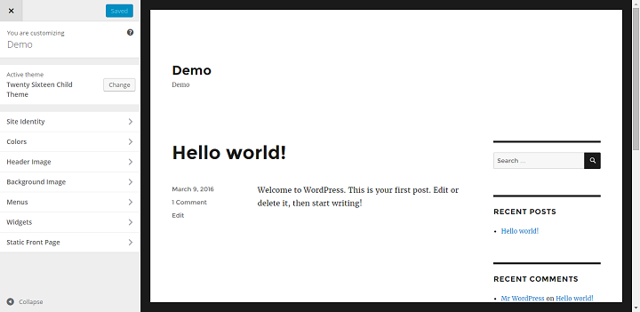
The first place you should look when you want to change the design of your theme, is the WP customizer.
Depending on the theme, you might be able to change the color scheme, change the fonts of different pieces of text in the theme, add or remove header images, set site logos, or even fill out custom sections of content for static pages. All quickly and painlessly from within the WP Dashboard.
Standard Sections in the WordPress Customizer
There are a few standard sections that
Site Identity
This is a default inclusion regardless of theme, where you change the site title and tagline, and often where you add a logo as well.
Colors/Color Schemes
Pretty self explanatory, this is a common section where you are able to change the color of different parts of the theme.
Header Image
Where you can add/change a header image, and sometimes control where it is placed or what size it should be.
Static Front Page
This is where you choose what you want the homepage of your website to display. Do you want to show the latest posts/articles, or do you want to show one of your pages?
The Customizer is perfect for making quick design changes to a theme, but the downside is that not every theme offers a lot of options in the customizer. This brings us to our next option.
2. Small Design Changes – Quick-fix Plugins
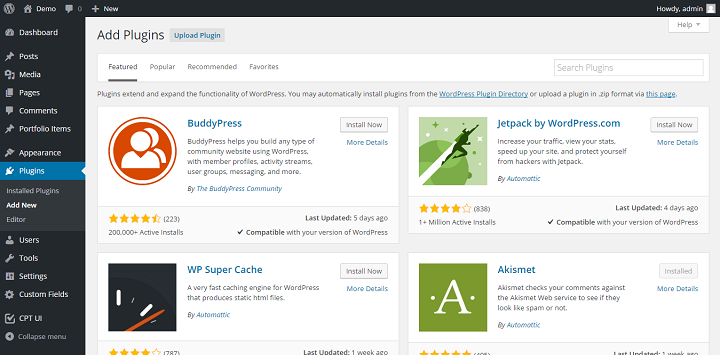
Is there just one or a few specific aspects of the design that bother you, but there is no options for customizing those specific things in the WP Customizer? There might be a plugin designed to fix just that problem.
For example, if there are a few colors that you don’t like in the theme, you can use a plugin like Theme Tweaker to change the color scheme of the theme you are using.
If your theme comes with a standard header image that you cannot change, or you want different header images on different pages/categories, there is a plugin for that as well. It’s called Unique Headers, you can use it to set unique headers for pages, categories and tags and more.
One problem with using quick-fix plugins is that they can have a negative effect on performance, especially if you use several of theme for a handful of things.
3. Small Design Changes – Page Builder Plugins
Plugins bring us to page builders. These days page builders vary from build-from-scratch themes (that come with a variety of layouts to choose from) like Divi, or WPMU’s Upfront. Then we have page builders that gives you full control over the content inside a page or post, but none over the actual theme around it, like Visual Composer or Beaver Builder. This is probably the best option for you if you really like the design and feel of your current theme, but you really want to easily create compelling dynamic pages for your website.
Using a pagebuilder makes it easy to create a page with multiple columns, even if the theme itself only supports one. They also come with different complex layouts that you can easily fill out to create complex pages.
This makes it easy to create pages like portfolio pages, landing pages, compelling about pages, and more. And it also makes telling stories more interactively easy by making it possible to add in media to your posts in many more formats.
If you’re wondering what page builders to look into, we’ve done a side-by-side comparison of 6 page builder plugins right here on WPKube.
Freddy Muriuki also did a great write up on the Beaver Builder plugin.
The downside of using page builders is that they’ve been known to negatively effect performance. Luckily we can counteract this by using a caching plugin like WP Rocket, W3 Total Cache, or WP Super Cache to display static html pages.
Another downside is that it can be tricky to migrate away from a particular page builder down the line, if it stores all the content outside of the standard WordPress database procedures for storing content.
4. Medium Design Changes – Change CSS Using A Plugin
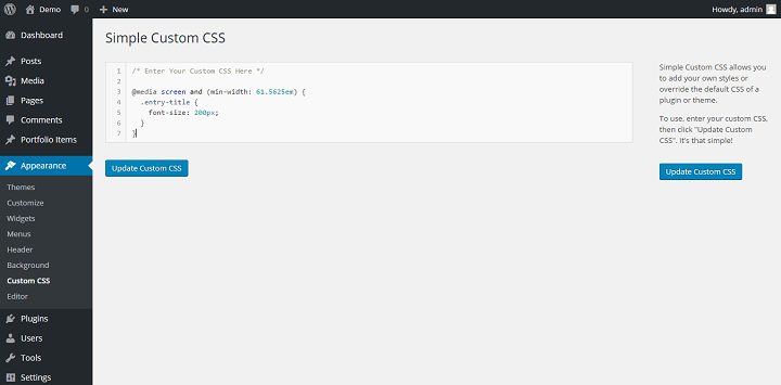
Now we’ve made our way all the way down to some actual coding. CSS is a programming language that works in tandem with HTML to produce the websites that we see today.
HTML works basically like a skeleton, it tells things where they should be in general and adds the text, images and most other content. CSS styles everyhing, it puts flesh on the bones and decides exactly how the finished product will look.
You can use the Simple Custom CSS plugin for this, or just use the CSS Editor part of Jetpack.
The first thing you’ll want to do, is learn some basic HTML/CSS. You can do this for free by going through a course over at Code Academy, or you can go through tutorials at w3schools . (Or you can check out one of the paid options like Treehouse.)
Then before you start working with a Custom CSS plugin, you need to know how to do two things, how to find out the class of the element you want to style, and how to properly target it to make changes in a responsive theme.
All you need to do in chrome is to highlight the area you want to inspect, right click and click inspect. For example, you might want to inspect the title of a post on my WordPress site.
That will show you the relevant HTML and CSS for that section, in this case it shows us the html and css for the post title.
What’s important to be on the lookout for, is if you see any media queries in the CSS. (A media query is a function in CSS that is used to apply or not certain styles depending on things like screen size. Most commonly used to make websites more responsive.)
In this example there is a media query that says:
@media screen and (min-width: 61.5625em)
and it applies the following styles to our .entry-title.
font-size: 40px;
font-size: 2.5rem;
line-height: 1.225;
margin-bottom: 1.05em;
This means that those styles are only applied if the screen (or browser window) is wider than 61.5625em (or 985px). So if you want to change the how something looks specifically on a specific screen, you need to include the media query. Let’s say we want to change the font size for computer screens only, then we should use the same breakpoint, and write something like this in our custom CSS plugin.
@media screen and (min-width: 61.5625em) {
.entry-title {
font-size: 200px;
}
}
I’m giving the entry title a ridiculous font size so that we can easily see the contrast between the screen sizes to confirm that I’ve written the correct code.
On a big screen, my entry title now looks like this:
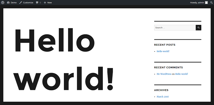
But if I go down to mobile/tablet size, my entry title remains unchanged. That’s what you want.
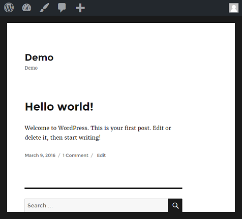
It’s important to look at all the breakpoints for a theme and working with them if you want your design to remain consistent and cohesive.
5. Significant Changes To Design – Use A Child Theme
If you want to make any significant changes to a theme, you want to use a child theme. That way, even if you update the theme (or WordPress does so automatically) you won’t lose any of the changes or additions that you’ve made.
The first step to working with child themes, should be to set up a staged site, or to set up a local development environment.
Then you can read more about how to set up and work with child theme quickly with this guide, or go a little more in depth with this one.
Relevant Guides and Tutorials:
- Add New Widget Areas To Themes
- How To Add Site Logo Option To The WP Customizer
- How To Work With Page Templates
This is the highest standard for making design (or other) changes to a theme. There’s basically no limit to what you can change or add to a theme with a child theme, except for the limits of your own coding skills.
The only downside is the fairly steep learning curve that comes with working with child themes.
Conclusion
While there are a few different ways to change the design of a WordPress theme and your site, it does come down to one thing in the end, code.
So if you want to become perfectly in control of how your website looks, learning how to code (at least the languages most relevant to how WP looks, HTML and CSS), is the way to go. If you choose to also get familiar with PHP and WordPress functions, you will also be able to control not just how a theme looks, but how it works and what it can do as well.





Really great article Ragnar,
I can remember fighting with each theme settings to get it look as I want back in time. For WordPress users who don’t want to settle with predefined theme settings or go deep into writing their own CSS from scratch I can recommend free plugin Live Composer https://wordpress.org/plugins/live-composer-page-builder/ Unlike Beaver Builder, it comes with all the design/styling settings in place and you can create all custom header/footer as well if you stick with their free theme https://livecomposerplugin.com/downloads/orao-theme/.
I tried Visual Composer, Beaver Builder, SiteOrigin and Divi. So far Live Composer is the best when I need to create custom well looking website form scratch and Beaver Builder https://wordpress.org/plugins/beaver-builder-lite-version/ is the second when I need to follow theme styling and don’t want the client mess-up design and he needs only text and image elements. Free version is very limited.
Also there is lot of CSS customizers for WordPress like CSS Hero or SiteOrigin CSS Editor https://siteorigin.com/css/ and few more on CodeCanyon. These are prefect for users who don’t care about page structure and need only style elements.