Are you ready to update your WordPress website, but you’re struggling with the decision which font to choose? There are just so many. How are you supposed to know which are the best Google Fonts to choose for your site? Especially, since the choice of fonts has real-life consequences for the success of your website.
If all else fails, sometimes the best solution is to start with the most popular choices. That’s what we will do here. In this post we will list and discuss the most-used Google Fonts. You will also find a number of tips on how to best incorporate them into your WordPress website.
In the end, we want you to have a better idea about what are some of the most popular fonts out there, why people love them and how they can help your site look better.
Here are 17 of the Most Popular Google Fonts
Alright, in the list below you find examples for some of the most popular fonts the Google library has to offer. You will also learn the number of styles they come in and which other typefaces they go well with.
1. Roboto
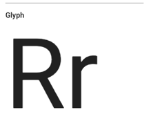
- Sans Serif
- 12 Styles
- Font Example
Rockin’ Roboto is a star, reveling in being the most popular font with a record number of almost 60 billion uses. It’s most popular in the US but boasts high usage from Japan to Brazil. Roboto was made specifically to be the best of both worlds with strong, clean lines, yet gentle and friendly curves. Google suggests Open Sans, Lato, Montserrat, Raleway, and Oswald as popular pairings for Roboto.
2. Open Sans
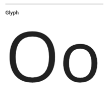
- Sans Serif
- 10 Styles
- Font Example
Outgoing Open Sans is here for readability. It’s a neutral font, a font that wants to be everyone’s friend with accessibility both on mobile platforms and print. Open Sans likes being liked with almost 30 billion uses in the US, France and Russia. Its popular pairings are Roboto, Lato, Oswald, Raleway, and Montserrat.
3. Lato
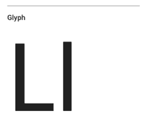
- Sans Serif
- 10 Styles
- Font Example
Lively Lato is a no-funny-business kind of font with no time for serifs — it has a job to do. Its corners are precise, clean and sharp, which makes a professional statement for its almost 10 billion users from the US to Brazil. Its Google pairings are Roboto, Open Sans, Oswald, Raleway, and Source Sans Pro.
4. Monserrat
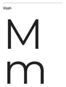
- Sans Serif
- 18 Styles
- Font Example
Memorable Monserrat is interested in staying unique like its namesake neighborhood in Buenos Aires, Argentina. It’s professional, but not for the sake of being rigid — it likes to be approachable for its over 5 billion users from the US to France and Brazil. Popular combinations with this font are Raleway, Open Sans, Roboto, Oswald, and Lato.
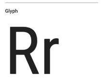
5. Roboto Condensed
- Sans Serif
- 6 Styles
- Font Example
Returning Roboto, this time in its “Condensed” form. The Roboto font family is a large one and this is the thinner sibling to our earlier example. It has been designed for those who need to conserve space and make the most of the room they have on their website. Over 4 billion people use this version and it is most popular in the USA and Russia. Popular pairings are Open Sans, Lato, Oswald, Montserrat, and regular Roboto.
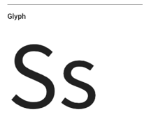
6. Source Sans Pro
- Sans Serif
- 12 Styles
- Font Example
Superb Source Sans Pro is a go-getter and takes its job seriously. Adobe developed it to work well for user interfaces and Source Sans Pro is the font for the task — almost 4 billion people use it in the US and France. Its goes well with Open Sans, Roboto, Lato, Oswald, and Raleway.
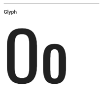
7. Oswald
- Sans Serif
- 6 Styles
- Font Example
Ornate Oswald is proper and enjoys fitting into the pixel grid of standard digital screens. Oswald likes things a certain way as it is used freely across internet platforms by almost 4 billion people, especially in the USA and France. It’s most often paired up with our regularly appearing Open Sans, Roboto, Lato, Montserrat, and Raleway.
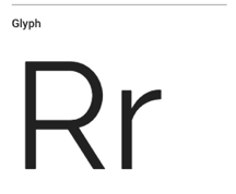
8. Raleway
- Sans Serif
- 18 Styles
- Font Example
Refined Raleway is ready to paint the town and lives in an art deco state of mind. Raleway brings an elegant, yet bold presence to any website. It was originally intended to only be a heading with one style, where it now boasts 18 styles and almost 3 billion people who use it. It regularly shows up together with Montserrat, Open Sans, Roboto, Lato, and Oswald.
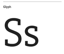
9. Slabo 27px/13px
- Serif
- 2 Styles
- Font Example
Specialized Slabo 27px/13px is most comfortable in technical atmospheres like a report printed off in a science lab. Although it has serifs, it still maintains a thinner and efficient look and over 2 billion people use it in the US, Indonesia, India and Brazil. Popular pairings are Roboto, Lato, Open Sans, Montserrat and Oswald.
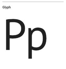
10. PT Sans
- Sans Serif
- 4 Styles
- Font Example
Private PT Sans is an introvert turned extrovert. It was first developed for the “Public Types of Russian Federation” project to help the people of Russia read and write in their native languages. By now, people use it across the world, although it continues to be most popular in Russia with under 2 billion uses. However, users in Turkey and the US also love it. Open Sans, Roboto, Lato, Raleway, and PT Serif all make great companions to this font.
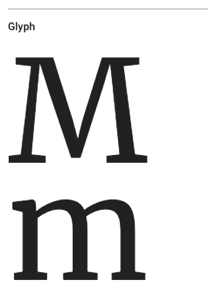
11. Merriweather
- Serif
- 8 Styles
- Font Example
Merry Merriweather is an open book with an easy-to-read style for every screen. It’s a font for the people with interestingly slight diagonals, open, rounded forms, and strong serifs. Under 2 billion people use it mostly in the US, but also Italy and Brazil. Its popular pairings are Open Sans, Montserrat, Oswald, Lato, and Roboto.
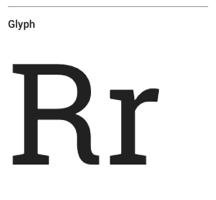
12. Roboto Slab
- Serif
- 4 Styles
- Font Example
Relaxed Roboto Slab is the cool cousin to the regular Roboto, bringing with it a sense of flair. It separates itself from regular Roboto with its unique style and doesn’t care for saving space as much as Roboto Condensed because it’s too focused on expressing itself. Under 2 billion people use Roboto Slab in the US, Russia, Italy and Brazil and it goes well with regular Roboto, Open Sans, Monserrat, Lato, and Raleway.
13. Noto Sans/Serif
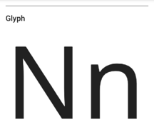
- Serif or Sans Serif
- 4 Styles
- Font Example
Neighborly Noto Sans is an international kind of font — it enjoys partaking in different cultures as it was meant to be compatible with multiple languages. Over 1.5 billion people use it and they are mostly located in the US and Brazil. Noto Sans likes to cozy up with Noto Serif, Open Sans, Inconsolata, Roboto, and Source Sans Pro.
14. Open Sans Condensed

- Sans Serif
- 3 Styles
- Font Example
Optimal Open Sans Condensed isn’t an envious font, but it felt it was missing out when Roboto Condensed made its debut. Open Sans Condensed is another way to conserve space and to get your message across a little more efficiently than regular Open Sans. Under 1.5 billion people use it in multiple places like the US, Russia, the UK, Italy and France. Popular pairings include regular Open Sans, Roboto, Oswald, Josefin Slab, and Amatic SC.
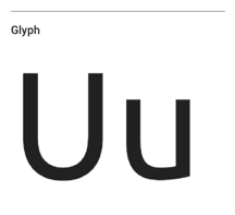
15. Ubuntu
- Sans Serif
- 8 Styles
- Font Example
Unforgettable Ubuntu is an equal opportunities kind of font. It holds a philosophy similar to Noto Sans by believing that all languages should be able to utilize it. Ubuntu boasts usage by over 1 billion people in multiple countries, such as the US, Russia, Italy, France, Spain and Brazil. It likes to appear with Open Sans, Roboto, Lato, Oswald, and Raleway.
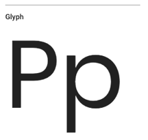
16. Poppins
- Sans Serif
- 18 Styles
- Font Example
Peppy Poppins brings life to geometric patterns and combines order with fun. Its favorite shape is the circle as it’s used to smooth out edges and corners to add a gentleness to its organization. Over 1 billion people use it, mostly in the US and France, where they like to include it with Roboto, Open Sans, Raleway, Oswald, and Playfair Display.
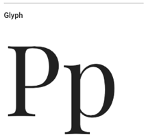
17. Playfair Display
- Serif
- 6 Styles
- Font Example
Professional Playfair Display stands firm with its broad serif while still pairing soft, rounded edges for approachability. This looks great in print and has a strong magazine vibe to it. Just over a billion people use it, most often in the US, France, Italy and Spain. Roboto, Open Sans, Lato, Montserrat, and Raleway can most often be seen together with Playfair Display.
Best Practices for Implementing Google Fonts in WordPress
Now that you’ve seen a complete list of fonts and have an idea of what each looks like, you can choose one that you think complements your style the most. However, after you have picked a font, are you finished? Not quite. You’ll have to make sure that the typeface you chose is being utilized to the fullest.
So, where do you begin? We’ve listed some recommended next steps below to help you optimize the way you use fonts on your WordPress website.
1. Choose a Font that Fits Your Site
Raleway has an art deco feel, Merriweather possesses lightness, and Playfair Display boasts a magazine/print vibe. Ask yourself what style your brand embodies and then choose the font that reflects that.
2. Form a Creative Structure
When choosing one the above fonts, decide which you want for your headings, your body text and your subtitles. Pick fonts that complement one another. Larger fonts that are bold, italic, etc., catch the eye and are strongest as headings.
3. Limit Your Font Styles
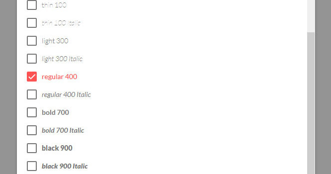
As you can see, some of these fonts have up to 18 styles. However, just because you have that many options, it doesn’t mean you need to use them all. Generally, it’s a good rule of thumb to only use three — regular, bold and italic. Too much and it could end up slowing down your site. When selecting fonts from Google, you can pick which styles you want to include so that you avoid downloading too many and impairing your website performance.
4. Keep Readability in Mind
The World Health Organization concluded that there are roughly 1.3 billion people in the world living with a visual impairment. Many of them are on the web and part of accessibility is making sure your site is also easily usable for them. However, even those that don’t belong to this group prefer websites that are not hard on the eyes.
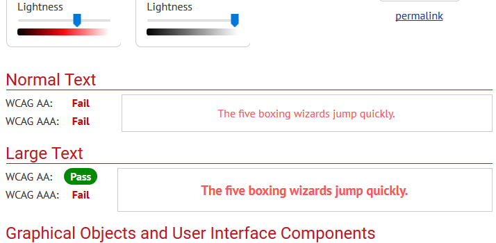
For that reason, when displaying fonts on your site, readability is an important factor. For example, choosing neon colors in Comic Sans is a poor choice. So, making sure that your font is pleasing to read will help your site be more friendly for all your users. One of the most important things here is contrast, which you can check with this tool.
Aside from that, it’s always a good idea improve your site’s accessibility.
5. If You Have a Unique Font, Host Locally
You can host a font locally on your server to try and improve performance. If it’s a Google font, that most likely not necessary as Google’s servers usually respond really fast. However, there are other reasons to locate your font files on your server, especially the new GDPR rules. In addition to that, if you use a unique font that isn’t provided by Google, it’s recommended to host it locally on your server to increase performance. This plugin is a great solution for both cases.
What Are the Best Google Fonts for Your WordPress Site?
Finding the right font for your website is not always easy. There are so many fonts out there, so finding one that fits your brand can be a challenge. However, starting with the most popular fonts out there can be a good start. After all, they are popular for a reason.
The above post gives you a rundown on the best Google fonts according to the masses. It also tells you important details such as the number of available styles and which other fonts they pair well with, so you can hit the ground running.
Once you have made your choice, follow our detailed tutorial to get the typeface onto your WordPress site. If you are thinking about hosting it on your own server, you can use the plugin mentioned above to do so. After that, all that’s left is to tell us which font you chose and why. We’d love to hear from you.
Which do you think are the best Google Fonts and and why? Let us know in the comments section below.


Thanks for the article… great stuff.
Quick question… let’s say I visit a website which has a font that I really like… how can I find out what font they use on their website?
Cheers,
Engin Soysal
Hey Engin, great question! You can find that out with the browser developer tools. Open the Page Inspector (Ctrl+Shift+C in both Chrome and Firefox) and then mark the text for which you want to know the font by clicking on it. This will show both the HTML element and associated CSS at the bottom of the screen. In the CSS styles, click on the “Computed” tab and then look for “font-family”. You will see the name of the defined font behind that property. Note that there are most often several fonts. That is to provide backup typefaces in case a user’s browser doesn’t have the first choice or can’t use it for any other reason. In some browsers, the one that is currently active is underlined, however, it usually is the first one. Hope this helps!
Hi, ENGIN
If you are using Chrome for surfing on the web then this tool may help you.
https://chrome.google.com/webstore/detail/font-identifier-by-whatfo/ncjkkfbddfkkemiejpfdgjcifjmbcloc
BTW I’m not associated with the company 😉